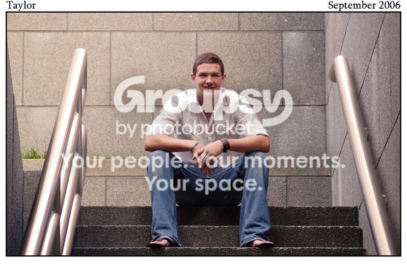
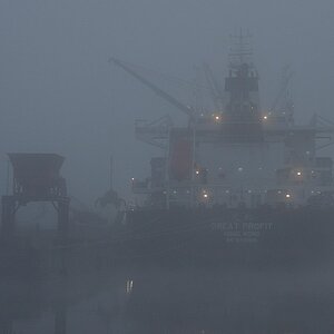
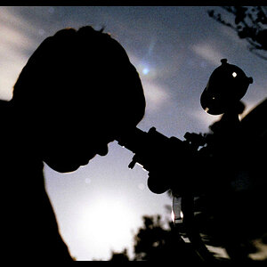
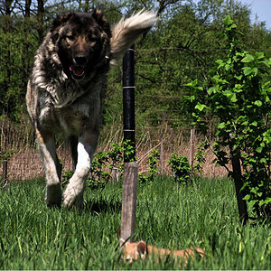
Actually A portrait should be about the person, thats to me is why it's called a protrait. For a portrait the background in number one is distracting to me and I think it should have been cropped verticle since people generally have verticle lines (no marc not always). Generally speaking I think the crop should follow the subject...
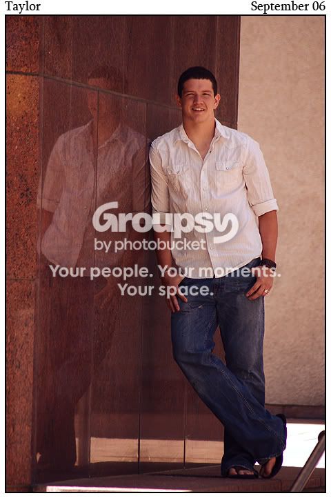
Number two is much better that way and I don't know how you could have done differently but there seems to be is a really strong line that is cutting his body in almost halves.
The approach is very good and the critique is just technical stuff. And trust me I probably am going against what everyone else here thinks. But that's just my opinion. I think my 2cents is worth about .0001 cent in todays market.