Maybe its just me but 1-4 all give me the feeling that the horizon is crooked, all with the left side of the photo being lower than the right. The sun feels too centered in 1 and 4, but I like how the colors came out in #3.
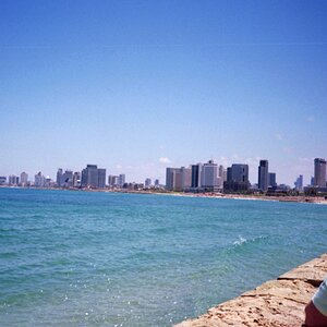
#1 - In this one, you've given the water and the sky pretty much equal real estate... but I think the sky has much more to offer. The addition of the boat is a nice touch, though it could've been closer to the bottom of the frame, allowing you to include more of the sky.
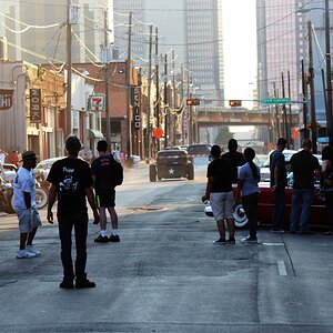
#2 - A nice exposure, nice colors... but the composition leaves a little to be desired. While the majority of the scene is nice, the rock piling at the bottom-left is kind of a stray element in the photograph. It doesn't really contribute the photograph, but it does distract a viewers eyes. Probably would've been best to either find a way to make it a more integral element, or just leave it out altogether.
#3 - This shot has potential, but a couple elements could've been changed to make it a better shot, I think. I think that the tree silhouette would've had much more impact if it extended above the distant shoreline... as it is now, it's sort of "stuck" in the bottom half of the frame against a background of water. Overall, I think this shot would've worked out a whole lot better if took a few big steps to right and crouched down about three feet. That way, the tree silhouette could've extended into the sky and that nice setting Sun would'nt be covered.
#4 - Refer to #2.
In each shot, it wouldn't hurt to rotate the photograph until the horizon is perfectly level. In fact, the un-level horizon lines were the very first thing that jumped out at me.
Also, in general:
Before you click the shutter on scene with two main elements (ex. water, sky)... ask yourself which element deserves the most real estate in your photograph. Sometimes you'll find that each contributes equally... but much more often, you'll find that one deserves considerably more attention than the other. In those cases... give that element its due and fill more of the frame with it. If there's a lot of "dead space" in the water, make better use of your frame by showing more sky than water.
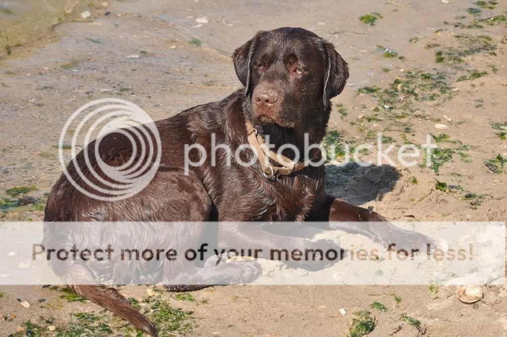
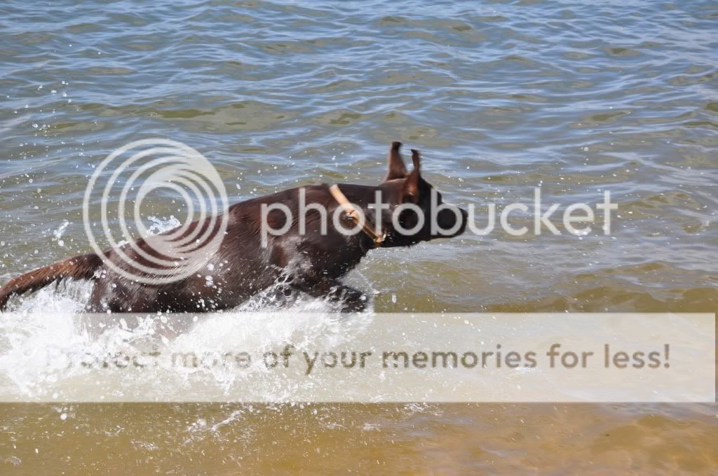
I like number one. I agree with what has been said. I would have presented more sky and less water. I do like it though. Good job! Good looking dog! I love chocolates!


![[No title]](/data/xfmg/thumbnail/30/30865-3dc03385b0036f80524b0636d0d56f07.jpg?1619734484)


![[No title]](/data/xfmg/thumbnail/37/37170-3e18af574ed51cce5bdf99af9d3cab40.jpg?1619737908)
![[No title]](/data/xfmg/thumbnail/30/30861-fee88082ba36d0c3b443492fe3f3f1cd.jpg?1619734481)