Trying this newspaper thing again.

BLS

TPF Noob!
Joined
Aug 23, 2004
Messages
216
Reaction score
0
Location
Southcentral Pennsylvania
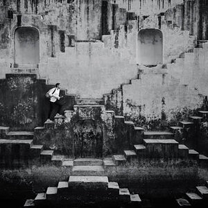
My previous post of this scene didn't get much response. I was curious to know why the shot lacked appeal. Was it the composition, the lighting, the subject matter or what? So I thought I'd post these two versions of the same scene to get your reponse and help me know what went wrong. Please let me know your thoughts.

News_0503E.jpg


News_0510E.jpg
 
It's okay, and I think maybe that's the problem. For me, the angles(both up and down and off to the side) doesn't really make the shot. If this where for example, taken straight on and really tight on just a few, it would have more impact. Then what's behind it wouldn't distract you so much. Just my 2 cents.
 
To me the top photo is much stronger, the colors leap out at the viewer. Also, the top photo sets up a conflict between the trees in the background (nature/life/growing/etc) and the natural enemies of trees . . . . NEWSPAPER!! The telephone pole in the background of the lower photo weakens that statement.
 
my .02

i like what you're trying to do but i think it needs a punch. if i were going after this i would try to catch the hustle of early morning workers heading off for the day. get a tripod, step back a bit, and use whatever you have to slow the motion down by adding cars and people stopping by grabbing papers. the blur of the cars and people would create a mood. your image would then have something to say. as it exists, you're simply showing us a bunch of paperboxes.

again, just my opinion.

oh, and maybe b&w??? ;)
 
I agree with JM... I think I know what you are trying to show us...but it's just not all that exciting. I think you could use these paper boxes in conjunction with something else, however.
 
Thanks, everyone, for your comments. I found them very helpful. I'm now thinking of ways to reshoot this to make it more interesting. If I get something worthwhile I'll repost, although it might be a while before I get back to that site.
 
I would play with DOF and as others mentioned, try B&W and getting some motion in the picture.

Personally, the suject doesn't speak to me the way it is presented currently.
 
1st Question: Why do YOU think the shot lacks appeal?
2nd Question: Why did you take the picture? What were you trying to do?
These are questions that you need to think about. The pictures don't work because the viewer has no real clue as to why you want us to look. As it stands it is just a straight record shot - like a police line-up.
 
I agree with all that's already been said. It just looks like you took a picture of your newspaper boxes when you were walking down the street. I like the colors here but the composition/angle just isn't there. Maybe if you tried the same thing from the ground looking up or some other wild perspective. I read in a book once that most people see the world from around five and a half feet...you've got to show them the same thing from somewhere they're not used to seeing it.
 

Most reactions

Back
Top