

Raincheck
No longer a newbie, moving up!
- Joined
- Jun 23, 2011
- Messages
- 222
- Reaction score
- 98
- Location
- Dublin, Ireland
- Can others edit my Photos
- Photos OK to edit
Hi forum,
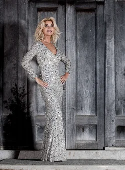
Again we are all amateurs and trying, make-up, hair and stylist even this dress and others are hand made.
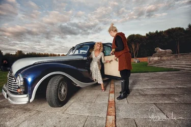
1949 BMW and our stylist.
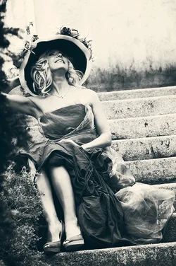
Another creation
Feedback is appreciated,
Rain
Again we are all amateurs and trying, make-up, hair and stylist even this dress and others are hand made.
1949 BMW and our stylist.
Another creation
Feedback is appreciated,
Rain



![[No title]](/data/xfmg/thumbnail/32/32934-eca2db7323b1a6e751e5de701244a4bc.jpg?1734162726)


![[No title]](/data/xfmg/thumbnail/37/37604-7ad625e983f92f880eb65a264eeef5e4.jpg?1734170732)
![[No title]](/data/xfmg/thumbnail/32/32933-a3726bc86a7c36fb222612f8aeab6b84.jpg?1734162721)
![[No title]](/data/xfmg/thumbnail/32/32929-22e23acc63d6ecb25e5ee941be87121f.jpg?1734162700)
![[No title]](/data/xfmg/thumbnail/32/32926-ec27ecead8c80d803404500d8f888dbf.jpg?1734162683)
![[No title]](/data/xfmg/thumbnail/32/32936-e1ef9b5cfbe2ae3e2dbd817af60d390d.jpg?1734162736)