I have been slacking and trying to take more photographs. Looking for what I could have done better either shooting or post processing. Still learning lightroom.
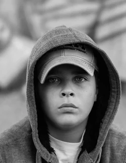
I think the composition is such that the eyes, nose, and mouth are to centered, weakening the image by it's lacking a bit of tension and drama.
I think the shadow cast by the ball cap is to dark. For a portrait, I think a person's eyes are the single most important element in the photo.
Beyond those points I like the tonal range and contrast of the rest of the photo.
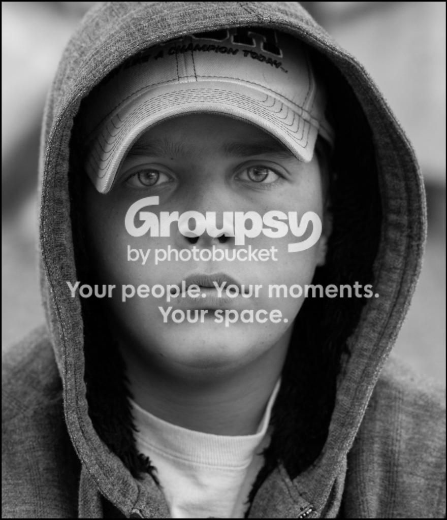
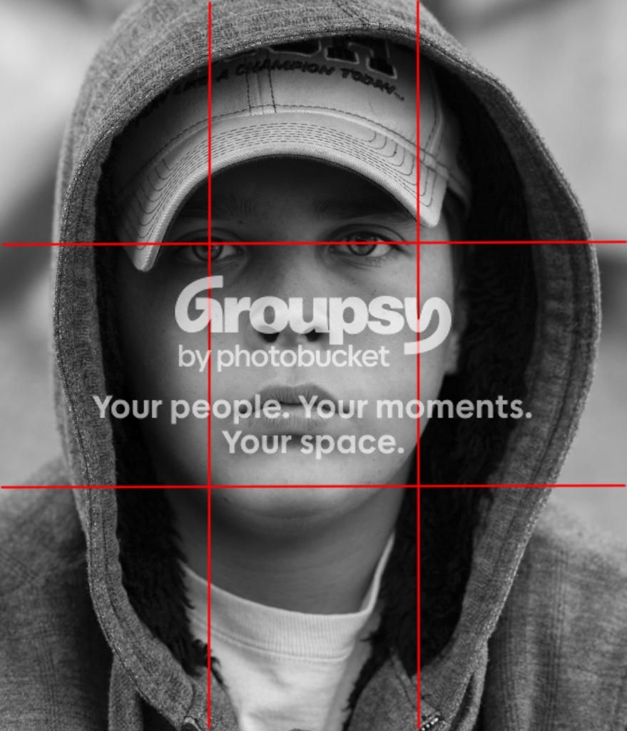
So I cropped so his right eye is on a rule of thirds (ROT) power point and both eyes are on the top ROT horizontal.
I also added some exposure (dodged) under the ball cap, locally sharpened his eyes, nose, and lips, and added a very narrow black border.







![[No title]](/data/xfmg/thumbnail/40/40306-ea393f71adcd88a9abb9fb16dc6af2d5.jpg?1734174714)