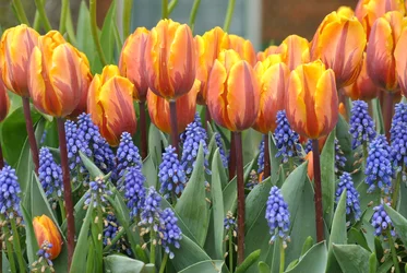
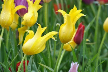
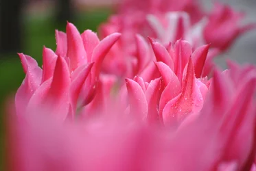
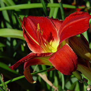
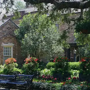
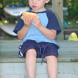
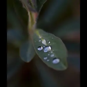
I can't tell you much on the technical side of things but I will tell you what I like and dislike. The one on the top left the colors are brillant nothing in the picture pulls my eyes in an one direction allowing me to enjoy the entire image. The top right one I think having the tulip in the foreground in focus would allow this picture to pop more. The one on the bottom the blurred foreground distracts me from the rest of the picture. Maybe try getting the first few rows in focus and allowing the background to become blurry. Thanks for posting them.