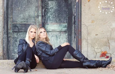
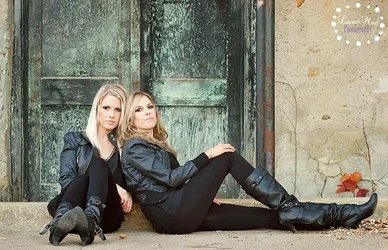
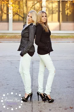
The first one is very very strong. I like the placement of all the objects in the frame, down to the leaves against the wall. The colors of the clothes work well with the colors of the doors, and the color on the wall is unobtrusive. Well done. I quite dislike Joe's edit, which might "correct" the clothes, but which spoils all the other colors and makes the balance of color in the frame wonky and unappealing.






![[No title]](/data/xfmg/thumbnail/39/39439-d0a6beaaf39993860b74ccbd81fdd122.jpg?1734173529)

![[No title]](/data/xfmg/thumbnail/39/39438-1eb8b5f82b59d9d0c72ae9025778ed4c.jpg?1734173528)