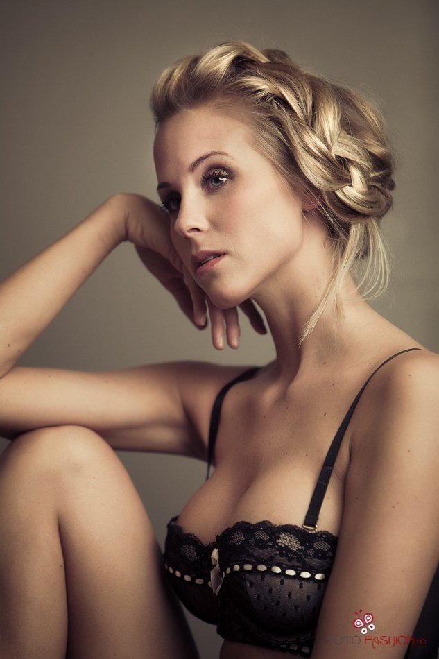
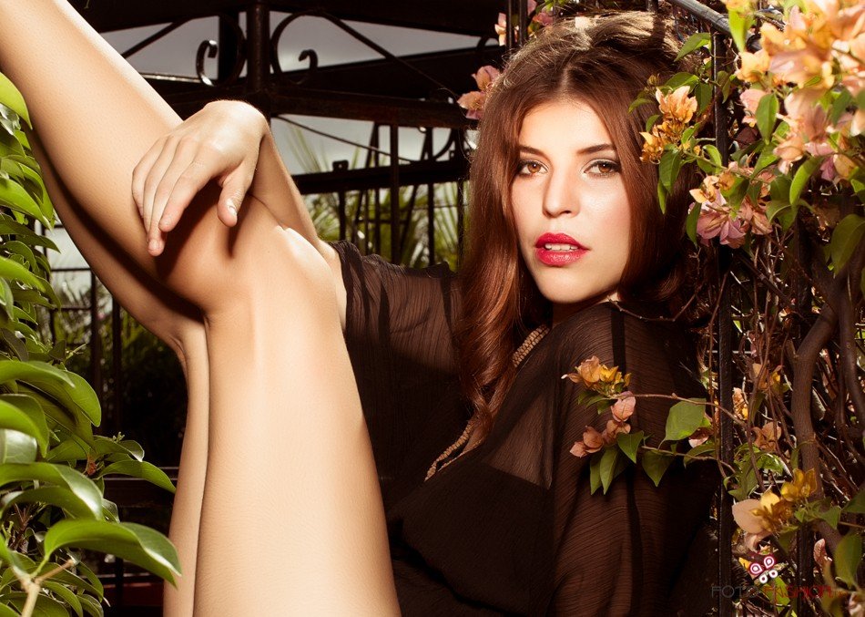
I like the first much more the the second.
In the second, there seems to be blown out spots on her face and legs and the composition is just a jumble - legs shooting up out of nowhere and hand intruding into prominence.
These are just in different classes, IMO.
I like both of them but I'm not a fashion photographer so I don't share Lew's view. In the 2nd one she is just a hotty and the lighting helps out that look. And nice legs too!
To be frank, as posted here, I don't like either one. The first has beautiful lighting, and I suspect that I could see more of her, I would think it a wonderful image, but the awkward crop ruins it. The second? Well... whose legs are those anyway????? The lighting is just a touch hot in this one, but nothing that couldn't be sorted in post without any issues....
The first has beautiful lighting and great potential. As the others have said, there are issues with the framing in both. The first could be lovely if it was cropped more loosely. As it is, she is feeling quite squished in the frame. The second one seems a tangle of legs /body/hand. It has the feel that her bum and feet were accidentally chopped off. With a pose like that, it really needs to include all of her.






![[No title]](/data/xfmg/thumbnail/1/1592-cfae4a7ea791f96c6e2d03484be2e454.jpg?1734142210)
![[No title]](/data/xfmg/thumbnail/34/34692-a218056da5698d6c9b7cf734f656562d.jpg?1734165698)

![[No title]](/data/xfmg/thumbnail/34/34690-8d6bc2af7ea1365e5e05cda2bbe8d08b.jpg?1734165696)