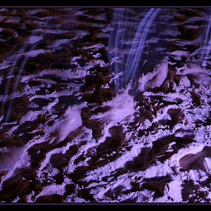
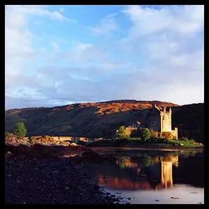
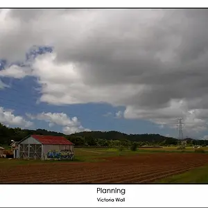
I'd appreciate any C&C on composition, technique, etc.
And here's a different angle in B&W.
I greatly prefer the color version, simply because cropping off the bow end of the boat in the B&W shot, plus the boat's placement, both terribly weaken the composition. Also, the white of the boat, being the brightest object in the frame, draws the eye immediately and repeatedly to....the ugly bottom of a boat. Also, the vignette applied to the building in the B&W looks heavy-handed and darkens the building; in the color shot, the building looks "light" on the yellow, and dark under the roof area, which is natural. Also, the clouds behind the building in the distance in the color shot draw the eye to the building a bit. The boat in the foreground, shown full-length, and the background of the pier work to balance the entire shot.
This is a good example of one weak photo and one strong one. The color photo shows us five different depth planes; the B&W shows us fewer. For example, in the color shot, the strip of water that lies above the bottom of the boat, but before the pier...that conveys depth very well. In the B&W shot, the amputated boat rests on a slab that shows no foreground below it (which the color shot does show!) and then the bottom of the boat covers up the water that intervenes between boat and pier...all in all, just NOT a good camera placement. To me, the color image is wildly successful, whereas the B&W composition and picture are both lacking.





![[No title]](/data/xfmg/thumbnail/1/1592-cfae4a7ea791f96c6e2d03484be2e454.jpg?1734142210)