PixelRabbit
A naughty little bunny...
- Joined
- Nov 28, 2011
- Messages
- 6,593
- Reaction score
- 3,719
- Location
- Ontario
- Can others edit my Photos
- Photos NOT OK to edit
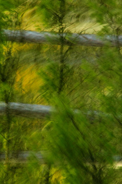
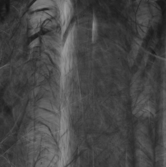
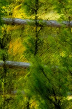
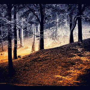
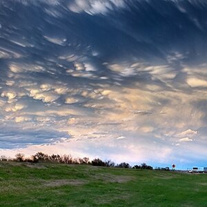
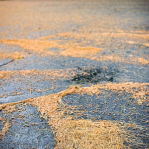
Here are my two most recent impressionistic shots. I quite like the green but there seems to be a bit lacking in the composition of the black and white but I like the feeling captured.
Would love to hear your thoughts, thanks for taking a look
Green
Lost in the Dark
Would love to hear your thoughts, thanks for taking a look
Green
Lost in the Dark




![[No title]](/data/xfmg/thumbnail/31/31017-dec7e898bd21f99b70534f8d06a4154c.jpg?1734159103)


![[No title]](/data/xfmg/thumbnail/31/31016-072880d9bc086c9fe71b9b1ae48603d4.jpg?1734159101)