Two New Photos (A Frog and a Building)

AgentDrex

No longer a newbie, moving up!
Joined
Jan 27, 2008
Messages
2,837
Reaction score
405
Location
Bemidji, Minnesota, USA
Website
flickr.com
Can others edit my Photos
Photos OK to edit
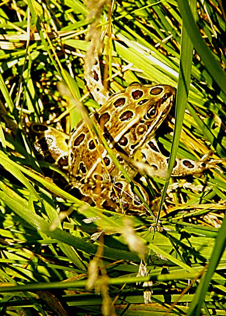
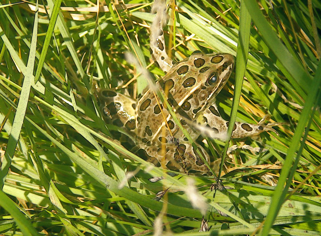
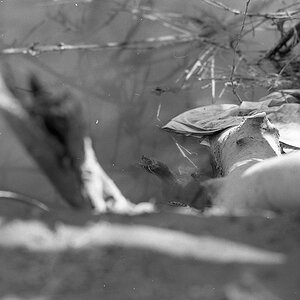
This first photo is a frog (just in case you couldn't tell) and I was attempting to show how camouflaged they can be:

6073065307_f59cdc68dc_b.jpg


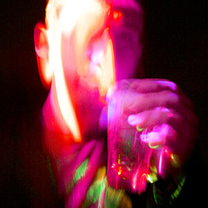
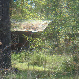
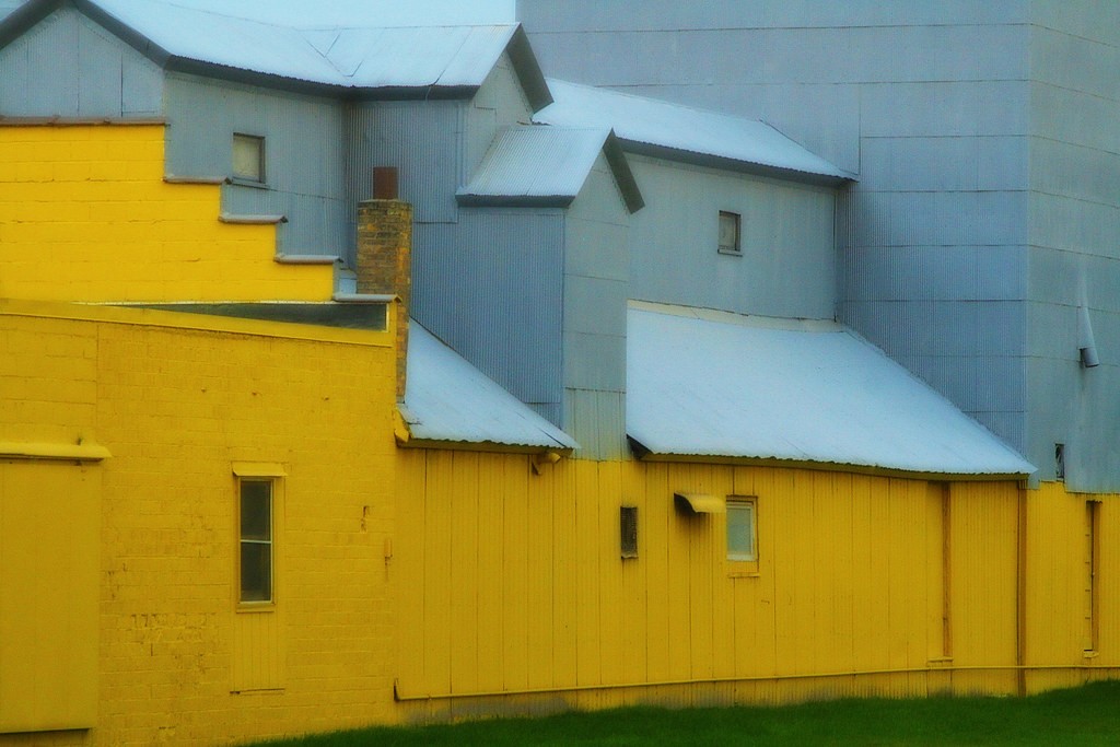
This next photo is a building (again, just in case you couldn't tell), I was attempting to focus on colors and shapes and I felt it would be good dreamy-looking, so I applied my dreamy-photo-technique:

6073604516_79d21ac3f8_b.jpg
 
#1 looks to me like you pushed the sharpening a bit too much and it needs some color correction.

#2 Doesn't really do much for me. It appears underexposed and I am not feeling the "dreamy technique." It seems like that technique has become a new novelty for you that you are just itching to use but are forcing it. It shouldn't be a sort of "try it on every photo" type thing. You should look at a scene and have that look in mind from the get go, and frankly a random building doesn't really seem like something that screams for that technique. The building has a bunch of wood paneling and brick work. I would have accentuated those textures rather than blur them with that action. Perhaps went in tighter on one specific spot. Like the window closest to the camera. You could go in tight on that wall at a straight on angle. You would have the window, the wood framing around and underneath, the brick work of the wall, the bold yellow color of the wall contrasting the single dark mysterious window. As it stands now, it just looks too forced, especially with the action added.

Hope this helps, its just one opinion though.
 
#1: I see where you were going, but I think it's too contrasty to the point of reducing image quality and being a distraction. Also, it's overexposed IMO. It seems like you put more thought into post than you put into taking the image. I think you could have done better.

#2: This is an interesting building with very interesting shapes and lines in an industrial two-tone. I think are some nice pieces of art in that scene but your composition doesn't go beyond a building with two colors. It does not induce any feeling in me. The post fuzzy application doesn't either. Also, if you are going to include the grass, I would make sure it goes all the way across the bottom of the frame so that it doesn't appear to be an accident. But if it were me, I'd get a long lens and try shooting some of the interesting areas where the angles and the colors work together. I think, given the right light, you can get some interesting stuff. And perhaps a HARD mid-morning or mid-afternoon light would work, creating even more lines and different shades within the two colors. Perhaps not. Experiment. :)
 
Sweet! Thank you much for the insight. I will go out this weekend and with all that in mind, attempt something different. I know exactly what you both mean. Thank you so much for the help. Awesome. I'm pumped! You all rock!
 
Well, it was a living frog, hence, yes, just a tad warm. Facetiousness aside, I'll take into consideration your comments and insights.
 
Great shot.well done!
 
In addition to the above comments, I suggest that the WB is way off to the warm side in #1.

Well, it was a living frog, hence, yes, just a tad warm. Facetiousness aside, I'll take into consideration your comments and insights.

That is what I meant by color correction.
 
It just looks too digital now. And it's eye now looks demonic. I fear that frog.
 
I was re-imagining it as a pseudo-painting...fear the frog...haha...I'm going to remember that statement for the rest of my life...thank you so much...what a great memory this will be...
 
The first doesn't do much for me. The composition isn't actually too bad, but the processing is very weird. You've got big black outlines everywhere which completely bury the subject, what did it look like straight out of the camera? I bet it looked pretty good.

I love the subject of the second but again, the processing has gone all unnecessary. You've got two great bright colours, some interesting shapes and textures in there and you lost them by dulling it and softening all the edges. I'd have gone the other way and increased the saturation a touch and sharpened it to really bring out the contrast between the two colours. I think that shot has got some real potential.
 

Most reactions

Back
Top