Understanding COLOR PROFILES...

ZballZ

TPF Noob!
Joined
Feb 28, 2009
Messages
2
Reaction score
0
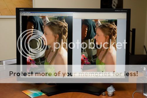
Understanding the importance of this has come to my attention, since my prints always look different than my retouched images in photoshop. Especially skin-tones are really hard to retouch, and it really frustrates me that the tone is off in the print...

But I cant really get my head around the best settings for my workflow when it comes to color profiles. As far as I understand, profiles to consider:

1) The camera has a profile - in my case an Eos Rebel: I have it set to Adobe RGB 1998.

2) The display has a profile, I work on my MacBook Pro set to Color LCD (I have messed around with different ones, but ultimate choose the native one, thinking that it might be more "true")

3) Photoshop has a profile. And I can honestly say I have always just left these settings alone.

Now, I know that retouching on a laptop in the first place is a sure mess-up, but this is just the way it is for me at the moment.

But could someone with more knowledge than me in this matter explain how the camera, display and photoshop profiles interact with each other, and how to work with these in a proper fashion. Do these profiles work on top of each other, or does the photoshop setting rule the others out?

And ultimately, an explanation to any kind-of-simple way to adjust the display and photoshop to a (better) "true-to-print"-colors would be AWESOME...

...any help appreciated, since this really bugs me and my head might explode soon


...zballz
 
You can set the Processing parameters for color tone and saturation...You might also set your camera color space to sRGB.... Adobe RGB will always give flat off color renderings without the proper processing software...

If you shoot in RAW, the software such as DPP allows you to change tones in almost infinite graduations..
 
Last edited:
Where are you getting your prints done? Some places will screw up your pictures once you have edited them. Usually I get mine from Snapfish for 4x6 size. Mpix is great for 8x10 (I just ordered some for half price...YAY!) Check with the lab to see if they are applying color correction. I got some prints from Mpix several months ago and there was one of my daughter where her skin tone had a very slight green tint to it. I knew that it didn't look like that when I edited it (my monitor is calibrated) so I checked my account details on Mpix and my account had them color correcting.

It sounds like your profiles may be set differently in different programs. Make sure they are all set to the same profile. I use sRGB. If you haven't already, you should check into calibration software. You will be surprised how off your monitor can be. Calibrating my monitor warms up the colors quite a bit. Left to the default settings, all my pictures would be too blue!
 
I do all my PP on a laptop. Sounds like you need to calibrate your monitor. Not with just a software program, but with a calibrator like the Spider3 or Eyeone systems. It will make a big difference.
 
Search for posts by Garbz on color info. He has a LOT of knowledge in his head about this and has made some excellent posts.

That being said, here are some basics (some of which kind of nullify some previous comments in this thread, I'm afraid).

- Some color spaces like Adobe RGB and ProPhoto give you a wider gamut of colors- basically they capture more colors than some other profiles do, and therefore will give you a more accurate capture of the scene.
- Most monitors and many printers, however, will not be able to display all the colors you capture, therefore making it -somewhat- moot... however, if you buy better equipment and go to better print labs you can take more advantage of this, and as time goes on presumably we'll see more color in devices more commonly.
- sRGB is kind of the "least common denominator". Most browsers, printers, image display systems, etc. will either handle sRGB, or when they utterly fail to manage color, will at least display sRGB reasonably correctly. sRGB is the most "safe", particularly for web display, but you do give up quite a bit of the color space when you use it.
- When you use software that DOES pay attention to color profiles (such as Photoshop), you just need to understand that if you save something off that ISN'T in a color profile that whatever you are going to display/print it in can handle, it's going to look flat or off. Know what profile your destination can support, and convert to that before you save.

Generally what I do is shoot in Adobe RGB 14 bit RAW. Then I work with images in 16 bit ProPhoto or AdobeRGB, I save images for archival and/or printing as PSD or TIFF in that format (I keep the RAW), and then save it off to 8 bit sRGB for web display.

EDIT: Oh yes, and you should definitely invest in something like a Spyder to color correct your displays. This is key if you care to have your images look consistent from display to print. It would be nice if it would get you accurate display across monitors, too, but unfortunately unless EVERYONE is color accurate on your display you are kinda hosed.

Here are a couple other useful links for you:

Color Managed Browsers
A Color Profile Diagram on Wikipedia
Why you should use AdobeRGB
A Thread on Print Labs
Megapixel Print Chart
 
Thanks for your replies! Although it still seems pretty complex, I feel I get the basics!

For the moment I realize that my main issue is most likely to be the display color profile. If anyone out there, like me havent invested in hardware-calibration, what color profiles do you use? I am on a late 2006 macbook pro, the 2.33 ghz Core2Duo model, so if someone has the same setup - I would like to know which color profile you use for the display....

thx.
 
Well, there are two layers here... color profile choice/consistency and calibration.

The color profile consistency/choice thing will ensure that your pictures look the same when you move from display source to display source, or medium to medium... but only assuming all devices are also calibrated (or at least reasonably close in their color settings at the time)
 
You are oversimplifying and confusing some of the parts of colour profiles. Here are the basics and how they relate to getting matching tones:

Colour profiles are split into several categories.

The camera provides an input profile. This tells the computer how to translate certain shades of colours the camera sees in to a standard LAB based colour profile (which had a name that escapes me right now). This standard profile forms the intermediate step during colour conversions from an input or working profile to an output or other working profile.

The working profile (as you have selected AdobeRGB) defines the colours you can work with. In general photography unless you grab a polariser and then bump up the saturation very little will fall outside the standard sRGB profile and AdobeRGB is generally not all that necessary. For example all those wonderful colour images you may have seen floating around the internet are in fact sRGB. Skin tones never fall outside sRGB.

The display has an output profile. Per default this is usually sRGB for 99% of monitors out there. Regardless of your working profile when you are editing what you see is no wider than the display profile for obvious reasons. A few monitors have wide gamuts and they need specific display profiles loaded (either from the manufacturer or from a colourimeter) otherwise they display typically oversaturated images with a characteristic red tinge in skin tones. Just to throw in a quick example of what this looks like, the correct representation is on the left, and the right shows an sRGB image just dumped to the screen without taking into account the wide colour gamut:
DSC_3950.jpg


Photoshop doesn't have a "profile" as such. It needs to know what profiles you are working with. It typically gets the screen profile from the operating system and can be seen if you go to Edit -> colour settings -> scroll down the RGB colour profiles and whatever "Monitor RGB" says is the display profile loaded by photoshop. This is usually either "sRGB IEC something" or the name of the file loaded from your calibrator if you use one. The working profile should automagically be imported so in this case Photoshop will set the working space to AdobeRGB since that is what you converted your image to when you offloaded it from the camera. This is verified easy enough by clicking edit -> assign profile and checking what the current one is. Finally if you soft-proof images photoshop needs to know the printer driver in the soft-proofing setup. Usually though it works entirely transparently if you don't. Photoshop relies on ICM or some other operating system function to tell the printer what the working profile is, and more often than not the printer driver handles the final conversion.


Ok so that is all rather pooly explained and a bit of a mind screw but I hope you get some idea of it. Now here is how to use it:

1. When opening a RAW file select either sRGB or AdobeRGB for the output. I recommend most people stick with sRGB since it is all their displays can usually display, and also the standard profile if an application somewhere opens your image that isn't colour managed. If you want to know how much (or rather how little) you miss when using sRGB even if you can print and work with wide colour gamuts then read my huge post here: http://www.thephotoforum.com/forum/...prophoto-colour-management-general-worth.html but only if you have a lot of time on your hands :)

2. Other than that if your monitor profile is loaded correctly then the rest of the colour settings should be transparent to the user except if the profile is wrong (which can happen as screens drift in which case a calibration unit such as the iOne Display2 colourimeter would create a new accurate profile for you).

3. A cause of your colour casts when printing could be the printer not doing colour management correctly. You can take over that feature in photoshop by doing softproofing which is well described in this pdf: http://homepage.mac.com/ilyons/pdf/ps6_sp.pdf

4. Errr good luck. This is a very very big topic to learn to do well. Just bear in mind that unless you have a perfectly calibrated screen in a carefully controlled environment and use a calibrated viewing booth to view your prints you won't actually get a 100% perfect comparison to the screen. One of the things to look out for is the colour temperature of an LCD is typically around 5500k to 6500k, whereas halogen room lights are around 2900k and fluros are around 4000k. So if you want to compare the print to the screen, take the print outside and look at it in the sun, see if the skin tones are ok then since your eyes will only adjust to one white point at a time (daylight is 6500k).
 
^^^ see, I told you Garbz was the man on this stuff. :)
 

Most reactions

Back
Top