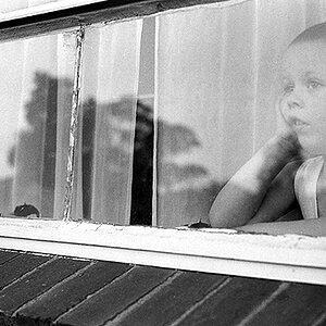
As far as the logo goes, I wouldn't give any concern toward it. This forum in particular is notorious for whining about even the smallest opaque watermark hidden in the corner of the image. To be honest it was the last thing I noticed, and I associate it completely with the brand, not the image. People here just like to complain about that stuff, when it honestly has nothing to do with the image itself, especially since it's not even in the way of anything.
As for the image processing, I think it looks good. If I may ask, what technique did you use to convert it? And did you use a curves adjustment layer? If you did, I alway think that pulling the little point in the lower left corner of the curves dialogue box adds a little bit of mood and depth to a black and white shot. Don't get me wrong, the tonal range is fine, but I do think it lack mood, and I think mood is very important for black and white portraits.
As far as posing goes, having her simply put her wrist on top of her head instead of behind it would work better in my opinion.



 Thanks !


![[No title]](/data/xfmg/thumbnail/37/37930-501fdf314a05686acde53d9899f68091.jpg?1734171674)