What's new

Untitled

invisible

Been spending a lot of time on here!
Joined
Mar 10, 2007
Messages
5,213
Reaction score
983
Location
Canada
Can others edit my Photos
Photos NOT OK to edit
p1403552010-4.jpg
 
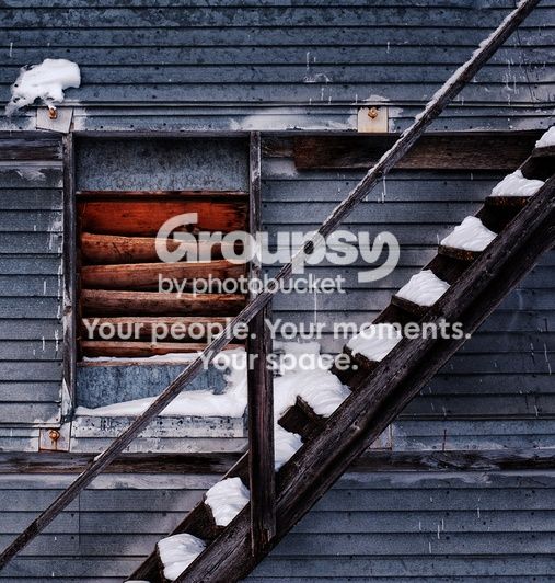
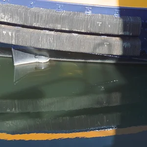
I like this very much... But I feel there is too much space left. I did a 5wx4h crop edging the far right... try it and see what you think! I can't decide if it improves it or not...
 
I like this very much... But I feel there is too much space left. I did a 5wx4h crop edging the far right... try it and see what you think! I can't decide if it improves it or not...
Thanks, Charlie. Please do post your version. I tried a different crop myself but in the end I settled for the uncropped take.
 
I like the color and texture but the composition isn't doing it for me.
 
I like the cropped version myself.
 
Thanks Majeed, I toyed with a similar crop but couldn't come up with anything that I liked (probably because what I had in mind when I shot this was the "window" – or whatever that is – dead centre). Your crop does work for me.

Here's the other crop I mentioned in my previous post:

p1403632346-4.jpg


Thanks for all the feedback, guys.
 
Wonderful color and texture, but I also felt the composition was just a tiny bit "off." I'd go with either your square centered crop or just enough on the left of the original to remove the plates on the left edge, and an equal bit on the right if you want it exactly centered.
 
I like them both. I do like the re-cropped on better. I agree the branch is distracting. Great photo... well done.
 
I like the bulls eye effect of the original shot as it sends your eye wondering around the image.... IMHO I like it uncropped. The tones are great, very nice shot, great find
 
I like this very much... But I feel there is too much space left. I did a 5wx4h crop edging the far right... try it and see what you think! I can't decide if it improves it or not...
Thanks, Charlie. Please do post your version. I tried a different crop myself but in the end I settled for the uncropped take.

This is a dupe of what I did last night.. still not sure about it...

$!!!.webp
 
Sorry guys, I don't get this. It got 9 likes (as of now), so I'm guessing it's me...and I mean that sincerely. To me, it doesn't convey anything (other than may be a depiction of the harshness of winter) and even technically it doesn't even seem balanced, which is really the most fundamental thing. The only appealing thing I see is that it has the nice blue/orange complementary colors, but that's about it. Could the OP or someone else please explain why this image works? Again, I'm not in the least bit being sarcastic, really curious to learn (and hope will educate other poor souls like me on the forum).

 
I'd go with either your square centered crop or just enough on the left of the original to remove the plates on the left edge, and an equal bit on the right if you want it exactly centered.
I agree about the plates on the left, they can be a distraction and they don't really add anything.

This is a dupe of what I did last night.. still not sure about it...
Thanks for taking the time. I'm not sure about your crop either – it feels kinda unbalanced (although it might still work as is). My first reaction is that I would crop a bit from the right.

Sorry guys, I don't get this. It got 9 likes (as of now), so I'm guessing it's me...and I mean that sincerely. To me, it doesn't convey anything (other than may be a depiction of the harshness of winter) and even technically it doesn't even seem balanced, which is really the most fundamental thing. The only appealing thing I see is that it has the nice blue/orange complementary colors, but that's about it. Could the OP or someone else please explain why this image works? Again, I'm not in the least bit being sarcastic, really curious to learn (and hope will educate other poor souls like me on the forum).
This is something between figurative and abstract photography. It's more about the lines, the shapes and the colour than it is about the winter – the snow here is almost an afterthought. You're spot on when you say it doesn't convey anything – this sort of imagery is just visual stimulus that either tickles your mind or it doesn't, period. I can't claim to be the inventor, though :) Regarding composition, feel free (but not obligated) to provide an edit that you feel would improve the balance. While I agree that the original crop might or might not work, the balance (or lack thereof) is not the problem in my opinion. I appreciate the feedback, by the way.

Thanks all for your candid comments and edits!
 
I like the image and with some hesitation; the hesitation is that the center of attraction(the window) is at the center of the image itself!!! you could have saved the situation only if the staircase were more slanted, which you cannot do anything about; with a contextual presumed permission i post my edit, which is my personal choice only; hope you bear with this ;)


Sorry guys, I don't get this. It got 9 likes (as of now), so I'm guessing it's me...and I mean that sincerely. To me, it doesn't convey anything (other than may be a depiction of the harshness of winter) and even technically it doesn't even seem balanced, which is really the most fundamental thing. The only appealing thing I see is that it has the nice blue/orange complementary colors, but that's about it. Could the OP or someone else please explain why this image works? Again, I'm not in the least bit being sarcastic, really curious to learn (and hope will educate other poor souls like me on the forum).

Hey Sekhar, nice to meet you :D
The likes you mentioned are spontaneous ones; at least mine one was that. I think the "like' could not be explained every time. If you did not like a curry, once you hear the recipe would you change your mind to say, "O, now i like this"?
Regards :D
 

Create an account or login to comment

You must be a member in order to leave a comment

Create account

Create an account on our community. It's easy!

Log in

Already have an account? Log in here.

Back
Top Bottom