amolitor
TPF Noob!
- Joined
- May 18, 2012
- Messages
- 6,320
- Reaction score
- 2,131
- Location
- Virginia
- Can others edit my Photos
- Photos OK to edit
- Banned
- #16
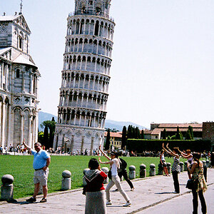
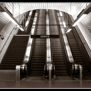
Sorry guys, I don't get this. It got 9 likes (as of now), so I'm guessing it's me...and I mean that sincerely. To me, it doesn't convey anything (other than may be a depiction of the harshness of winter) and even technically it doesn't even seem balanced, which is really the most fundamental thing. The only appealing thing I see is that it has the nice blue/orange complementary colors, but that's about it. Could the OP or someone else please explain why this image works? Again, I'm not in the least bit being sarcastic, really curious to learn (and hope will educate other poor souls like me on the forum).
It's the repetition of pattern, the repeated motif of parallel lines, that ties it together. If anything does. It looks more like an exercise in pattern and line than anything else. I agree that the crop is problematic, the frame doesn't feel right to me either and I don't think any of the edits have really cracked the code on that. Not even sure the code is crackable. OP's square crop, breaking up into 3x3 regions, seems like the best bet, but it didn't make it really go, for me.



![[No title]](/data/xfmg/thumbnail/41/41894-692c98920dde335de241400937ed6166.jpg?1734176247)
![[No title]](/data/xfmg/thumbnail/38/38733-21217cf4fc7d197a2f8b1e0e2d17b5a5.jpg?1734172600)
![[No title]](/data/xfmg/thumbnail/37/37642-b84a3ab0bc05ccd30092514e185e7c01.jpg?1734170765)

![[No title]](/data/xfmg/thumbnail/31/31980-e5048a424621c7b3cd0d306d63c09d67.jpg?1734160756)