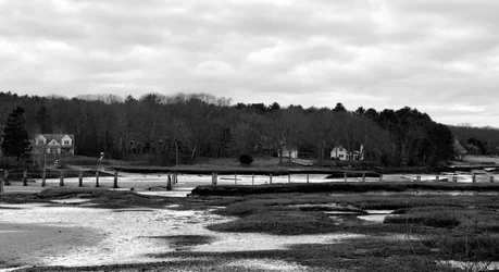
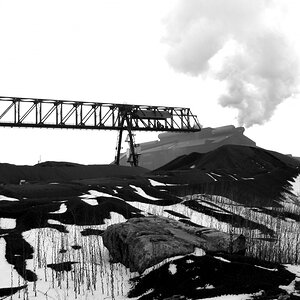
the last bit of this is particularly helpful. I prefer less middle and more high contrast but putting my preferences on this image was counter productive to what the image required. I should have just kept simple monochrome or even left it color while decreasing the contrast perhaps and increasing the sharpness. I did the total opposite. This is also yellow filtered. I need to think about this as I might have started from the wrong line of thinking from the beginning. For a detailed oriented image I should have been trying to increase the details. thankyou, all good insight.I try to figure out what exactly are you showing in this image. The composition is what I would call "indesicive": what is the focal point? What are you trying to attract our attention to? It is a classic example of a landscape composition with a horizon line going straight through the centre, as if the photographer does not really knows which part of the image is more interesting - the sky or the ground. In most cases there should be either one or the other.
The problem here is that the sky is not really impressive to say the least, and the foreground is also a bit boring. The interesting part starts with those poles and we also have three houses and a lot of trees and some other details. So apparently we need to zoom on this scene to make these details larger and basically turn these "details" into "objects", if you know what I mean.
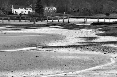
When zooming you need to decide what part you are going to lose, the foreground or the sky. I guess the foreground has to go. Then you need to decide if you really need all three houses in the frame. Often one (kind of lonely) house strategically positioned in a frame works better. But then again, you have to control the ratio i.e how large is the house compared to the overall space witching the frame. That is an important thing - the relation between the size of an object and the overall space in your image.
My other criticism is the harsh black and white conversion, there is too little middle tones, which are needed here to show the details. Such conversion tells me that the photographer wants to highlight major shapes rather than details and texture. But I do not see any coherent, interesting shapes in this image. The shapes of the pools are quite chaotic and do not create any coherent composition. So to my eye such contrasty b&w is not really justified here.
Just my 2p.

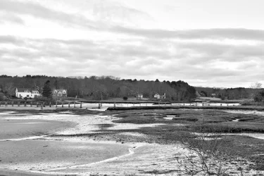
here is the original (thought tinted bw jpegI mostly agree with previous comments, although I think the foreground is actually pretty interesting. I think only one of the houses and more foreground would have been the way to go. Re B&W vs. color, you have to ask yourself which gives you the contrasts you need. Sometimes important elements are separated from the background/foreground by a color contrast, sometimes by tonal contrast, and sometimes color accentuates something you don't want as a major element.
it was raw). it isn't a strong shot anyway, but originally I tried to semi balance the frame in camera. And I liked the tide lines in the sand going to the opening in the poles. The right side of the foreground wasn't particuliarly wonderful but I didn't think was bad enough to totally get rid of it. problem is after I looked at it in post I noticed I had the edge of a guard rail in the bottom left and also that I didn't totally balance the frame even though I had thought it was close in camera. so I decided to crop. as I cropped I lost some of those tide lines. Really not a big deal because it wasn't a strong shot anyway. After looking at it then I decided it would be good to play with for experience. As I don't often get into processing and detail. so I figured I would take a closer look at it. which I screwed the goose on anyway going high contrast yellow filter.yeah. often the original pre crop does help. I really just got way to stuck on having that bush in the lower right concentrating on frame balance. tunnel vision I guess. And once fixated on having the bush to balance I stopped looking at the overall scene.Ah, it helps to see more of the scene. I think my approach to framing this scene would be to move to the left and put the house on the right and the break in the trees on the right side of the frame, losing the bush in the lower right of the original and the house on the left. Then (maybe), the tide lines and the edge of the beach would lead in to the house and opening in the trees. I wouldn't have done the B&W conversion much differently because the contrast works much better than in the original, although I might have pulled up some of the lower mid-tones a bit.

yes. strange how you think you moved to a point you are beyond a certain level and then once again you get thrown right back to the wolves of basic composition and how to capture something effectively. .Ah, it helps to see more of the scene. I think my approach to framing this scene would be to move to the left and put the house on the right and the break in the trees on the right side of the frame, losing the bush in the lower right of the original and the house on the left. Then (maybe), the tide lines and the edge of the beach would lead in to the house and opening in the trees. I wouldn't have done the B&W conversion much differently because the contrast works much better than in the original, although I might have pulled up some of the lower mid-tones a bit.
no. But if it looks like it was I will take that as a compliment. lolWas this shot with film?
in camera or in post process. And I am still not quite smart enough to know when to use what when. Pretty good at choosing bw or color in camera and sometimes the type of bw often I still fail on the filter I don't always grasp which I want until I play with it.no. But if it looks like it was I will take that as a compliment. lolWas this shot with film?
No, I was just surprised that you are using a yellow filter with a digital camera.