What's new

untitled

bribrius

Been spending a lot of time on here!
Joined
Jan 12, 2014
Messages
8,708
Reaction score
1,312
Can others edit my Photos
Photos NOT OK to edit
DSCN7863A.webp
 
  • Thread Starter 🔹
  • Banned
  • #2
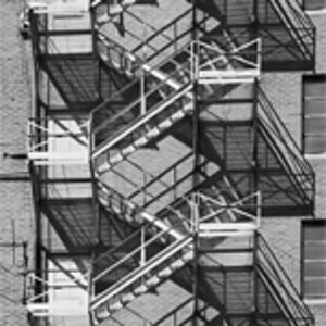
okay. so no one is commenting. It has zero likes on 500pissa. What exactly does everyone not like about this shot? curious since i kind of liked it.
 
To me, it's too busy. A busy foreground which mergest with a busy background, especially because of the commonality of tones. I think there might be a better image in there, you just need to tease it out.
 
okay. so no one is commenting. It has zero likes on 500pissa. What exactly does everyone not like about this shot? curious since i kind of liked it.
It looks as if you liked the detail, but it's very cluttered, and I don't know what it is. It has no special interest to me, therefore I don't have any comment.
 
It feels over-sharpened to me.

Compositionally there just isn't much for me to make anything of. It manages to be busy without anything that really draws your attention. I tend to sometimes like busy images, but only if there are things competing for my interest. Here we have a metal structure, some barbed wire and some woods, and to me, there's no path that it makes my eye want to follow. To me, that's how busy images can work, if they give you a path to follow.

THere's also no sense of depth, and it's a bit disorienting, but not in a fun way, in an unintelligible way. There are enough real world cues to know what it should look like, but the lack of depth cues just makes it kind of unsettling to look at. It makes me feel like I can't get my eyes to work right.

 
IMO, just too much going on and the sepia edit is blah.
 
  • Thread Starter 🔹
  • Banned
  • #7
It feels over-sharpened to me.

Compositionally there just isn't much for me to make anything of. It manages to be busy without anything that really draws your attention. I tend to sometimes like busy images, but only if there are things competing for my interest. Here we have a metal structure, some barbed wire and some woods, and to me, there's no path that it makes my eye want to follow. To me, that's how busy images can work, if they give you a path to follow.

THere's also no sense of depth, and it's a bit disorienting, but not in a fun way, in an unintelligible way. There are enough real world cues to know what it should look like, but the lack of depth cues just makes it kind of unsettling to look at. It makes me feel like I can't get my eyes to work right.
:biggrin-93:
 
  • Thread Starter 🔹
  • Banned
  • #8
Thanks guys. It was supposed mess with the eyes, lack depth, but have some visible layers. I liked some of the repetitions in the frame as well. Tried straight bw, looked busier. Added a vignette to give focal point (closest piece to you at this edge of the steel plate with black things on it) and it seemed to lose some effect for me. I will give your comments some thought.. I did like the lack of depth effect especially around those black things starting in the left third line.

thanks again.
 
Thanks guys. It was supposed mess with the eyes, lack depth, but have some visible layers. I liked some of the repetitions in the frame as well. Tried straight bw, looked busier. Added a vignette to give focal point (closest piece to you at this edge of the steel plate with black things on it) and it seemed to lose some effect for me. I will give your comments some thought.. I did like the lack of depth effect especially around those black things starting in the left third line.

thanks again.
yeah, I kinda got that that must have been what you were going for, however, without anywhere to really lead the eye, it was just unsettling with nothing to balance. It also just sort of makes it look like a bad photoshop job. You know where somebody just piles some images on top of each other artificially.
 
Thanks guys. It was supposed mess with the eyes, lack depth, but have some visible layers. I liked some of the repetitions in the frame as well. Tried straight bw, looked busier. Added a vignette to give focal point (closest piece to you at this edge of the steel plate with black things on it) and it seemed to lose some effect for me. I will give your comments some thought.. I did like the lack of depth effect especially around those black things starting in the left third line.

thanks again.
yeah, I kinda got that that must have been what you were going for, however, without anywhere to really lead the eye, it was just unsettling with nothing to balance. It also just sort of makes it look like a bad photoshop job. You know where somebody just piles some images on top of each other artificially.
nothing is piled. This is one shot. i tried with another i tossed in the "untitled " i throw stuff in over at just for fun. The dot pic. didnt make it either. want something that messes with the eyes. so i can hang it on my wall for company
 
Thanks guys. It was supposed mess with the eyes, lack depth, but have some visible layers. I liked some of the repetitions in the frame as well. Tried straight bw, looked busier. Added a vignette to give focal point (closest piece to you at this edge of the steel plate with black things on it) and it seemed to lose some effect for me. I will give your comments some thought.. I did like the lack of depth effect especially around those black things starting in the left third line.

thanks again.
yeah, I kinda got that that must have been what you were going for, however, without anywhere to really lead the eye, it was just unsettling with nothing to balance. It also just sort of makes it look like a bad photoshop job. You know where somebody just piles some images on top of each other artificially.
nothing is piled. This is one shot. i tried with another i tossed in the "untitled " i throw stuff in over at just for fun. The dot pic. didnt make it either. want something that messes with the eyes. so i can hang it on my wall for company
no, I realize it's one shot, what I'm saying is that people probably aren't responding because it sort of looks like a piled bad photoshop. The complete lack of depth cues is something we're used to seeing... with bad photoshop.
 
Thanks guys. It was supposed mess with the eyes, lack depth, but have some visible layers. I liked some of the repetitions in the frame as well. Tried straight bw, looked busier. Added a vignette to give focal point (closest piece to you at this edge of the steel plate with black things on it) and it seemed to lose some effect for me. I will give your comments some thought.. I did like the lack of depth effect especially around those black things starting in the left third line.

thanks again.
yeah, I kinda got that that must have been what you were going for, however, without anywhere to really lead the eye, it was just unsettling with nothing to balance. It also just sort of makes it look like a bad photoshop job. You know where somebody just piles some images on top of each other artificially.
nothing is piled. This is one shot. i tried with another i tossed in the "untitled " i throw stuff in over at just for fun. The dot pic. didnt make it either. want something that messes with the eyes. so i can hang it on my wall for company
no, I realize it's one shot, what I'm saying is that people probably aren't responding because it sort of looks like a piled bad photoshop. The complete lack of depth cues is something we're used to seeing... with bad photoshop.
oh. i got ya. Thanks. now how to avoid that??????? more to think about.
 

Create an account or login to comment

You must be a member in order to leave a comment

Create account

Create an account on our community. It's easy!

Log in

Already have an account? Log in here.

New Topics

Back
Top Bottom