forrey
TPF Noob!
- Joined
- Oct 21, 2011
- Messages
- 31
- Reaction score
- 2
- Location
- Ann Arbor, MI
- Website
- www.forrestmckinney.com
- Can others edit my Photos
- Photos NOT OK to edit
Hi all! Just joined the forum, though I've been lurking for a while. I'm a photography newbie but always wanted to try it for real and was finally able to get myself a 550D a couple months ago.
Anyway, I was just hoping to get opinions on some of the shots I've taken so far. No joke about the verbal abuse, I prefer blunt criticism so feel free to tear 'em up
Thanks
Side note: the first one is actually not selective color, it was just one brightly colored leaf in a pile of dead ones. (Granted, I did lower the overall saturation and up the orange/red in lightroom a bit, but not much. It was a strong contrast to begin with)
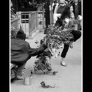
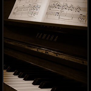
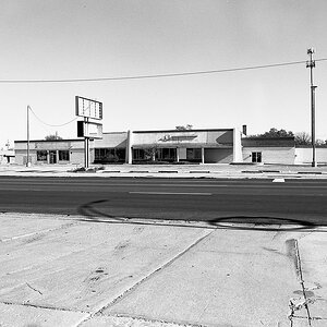
1.

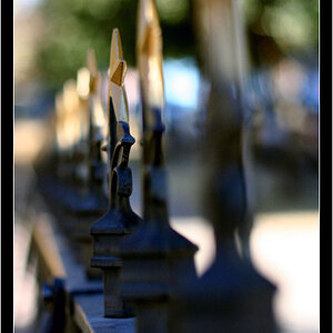
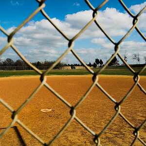
2.

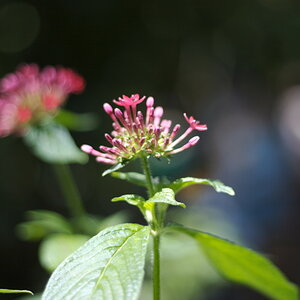
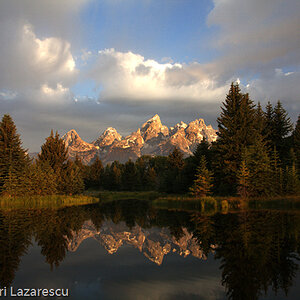
3.

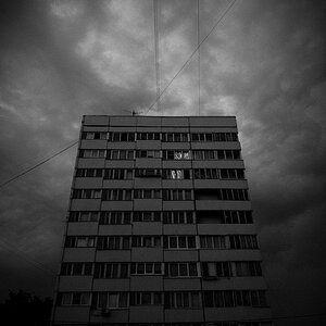
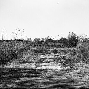
4.

5.

6.

7.

8.

9.

10.

11.

12.

Anyway, I was just hoping to get opinions on some of the shots I've taken so far. No joke about the verbal abuse, I prefer blunt criticism so feel free to tear 'em up
Thanks
Side note: the first one is actually not selective color, it was just one brightly colored leaf in a pile of dead ones. (Granted, I did lower the overall saturation and up the orange/red in lightroom a bit, but not much. It was a strong contrast to begin with)
1.
2.
3.
4.
5.
6.
7.
8.
9.
10.
11.
12.
Last edited:
 it does look like a raspberry but there were a bunch where I was shooting, they're all on stalks and I have no idea what they are
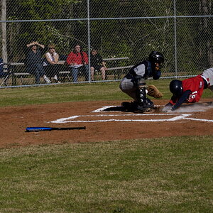
![[No title]](/data/xfmg/thumbnail/37/37606-3c9ffb5906173fa2aa489341967e1468.jpg?1619738148)