
Joshua_Lee
TPF Noob!
- Joined
- Aug 27, 2010
- Messages
- 57
- Reaction score
- 0
- Location
- Greenville, SC
- Can others edit my Photos
- Photos OK to edit
What is the rule of thumb when adjusting a photos vibrancy and saturation?
I tend to like the look of really vibrant colors in photos. I like higher contrast as well. What are your thoughts?
Is there a rule of thumb, or is it what ever appeals to the eye is good?
Thanks,
I tend to like the look of really vibrant colors in photos. I like higher contrast as well. What are your thoughts?
Is there a rule of thumb, or is it what ever appeals to the eye is good?
Thanks,
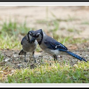

![[No title]](/data/xfmg/thumbnail/34/34132-7c7fbdcb2006703d33f975289561cd9d.jpg?1619736303)
![[No title]](/data/xfmg/thumbnail/37/37604-7ad625e983f92f880eb65a264eeef5e4.jpg?1619738148)
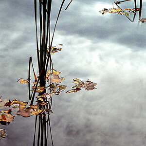
![[No title]](/data/xfmg/thumbnail/42/42063-eb634e07d8ad641481cc20fb5cf4d6de.jpg?1619739997)
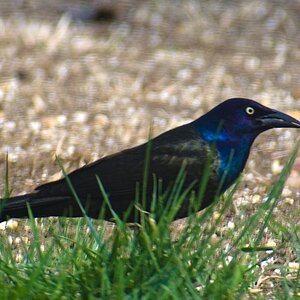
![[No title]](/data/xfmg/thumbnail/34/34134-d2249816e46b705693bfc543c9b1f481.jpg?1619736306)