

- Joined
- Dec 11, 2006
- Messages
- 18,743
- Reaction score
- 8,049
- Location
- Mid-Atlantic US
- Can others edit my Photos
- Photos NOT OK to edit
- Banned
- #16
Although you've moved way away from this, let me point out some things that occurred to me.
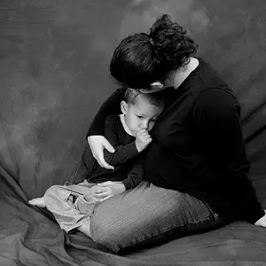
To me this looks to contrasty for a child's photo, too dramatic - and a bit cold and harsh.

There are also a bunch of design elements, besides the light, that a viewer would see.
When you have a symmetrical pose like this, elements that contradict and distract from it are noticeable.
His knees are at different heights, as are his shoulders.
Although his face is erect the midline of his body is tilted.
(My guess was that after he sat you might have asked him to tilt his head to the right so it would look vertical)
The in-focus lines of the chair are at an odd angle to the vertical and don't mesh with the background.

To me this looks to contrasty for a child's photo, too dramatic - and a bit cold and harsh.
There are also a bunch of design elements, besides the light, that a viewer would see.
When you have a symmetrical pose like this, elements that contradict and distract from it are noticeable.
His knees are at different heights, as are his shoulders.
Although his face is erect the midline of his body is tilted.
(My guess was that after he sat you might have asked him to tilt his head to the right so it would look vertical)
The in-focus lines of the chair are at an odd angle to the vertical and don't mesh with the background.

 I will, however, take that into account when shooting adults.


 Leaf_000725



![[No title]](/data/xfmg/thumbnail/41/41492-467958db3420bceb7ab410a12dcc681f.jpg?1734175885)
![[No title]](/data/xfmg/thumbnail/41/41493-60071420f928565170996b4edc3de2f0.jpg?1734175887)
![[No title]](/data/xfmg/thumbnail/35/35867-0c74c728d92f908264af585fd93bd36c.jpg?1734167586)
![[No title]](/data/xfmg/thumbnail/35/35871-d9de705fa64b06051419be6d3739d6ac.jpg?1734167599)
![[No title]](/data/xfmg/thumbnail/32/32173-af05ea40d00ae9cd79a01007df914b5f.jpg?1734161047)