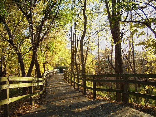
To my mind, the original version of No 4 is the pick of the bunch. Followed by the one WITHOUT the flare. But it doesn't beat the leading lines in 4. And I don't think fence and path should be brightened up as much as you did, invisible. While the sky asks to carefully be darkened just a bit, the path should remain dark. Leaves the lines the fence gives stronger.
And I don't think fence and path should be brightened up as much as you did, invisible. While the sky asks to carefully be darkened just a bit, the path should remain dark. Leaves the lines the fence gives stronger.
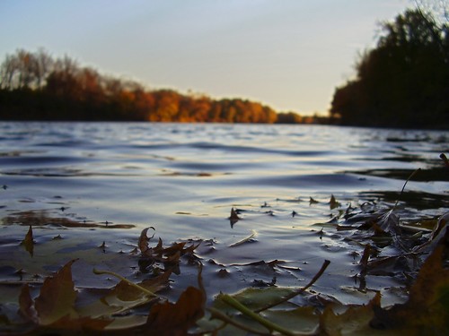
Well, you did recover some detail on the leaves in the foreground, but I personally think it's not enough. The amount of light in the background is higher than the amount of light in the area that's in focus (the foreground, your subject). I'm not sure how you can balance that out, but my first reaction (remember, I suck at this) would be to try and darken the background.

")
![[No title]](/data/xfmg/thumbnail/38/38261-db20f6f92ee8f0d4c5cf1536e308638b.jpg?1619738546)


![[No title]](/data/xfmg/thumbnail/35/35877-b537a0bce18fcb18b610d787610f3d3d.jpg?1619737203)


![[No title]](/data/xfmg/thumbnail/34/34114-dd12be026979ccd4182c5f478bd91448.jpg?1619736284)
![[No title]](/data/xfmg/thumbnail/34/34115-73b827c6a6db1413dcead11e4caaae69.jpg?1619736285)