ADavis85
TPF Noob!
- Joined
- Jul 25, 2011
- Messages
- 188
- Reaction score
- 11
- Location
- Owings Mills, MD
- Can others edit my Photos
- Photos OK to edit
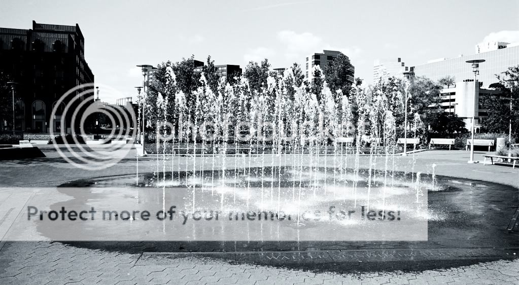
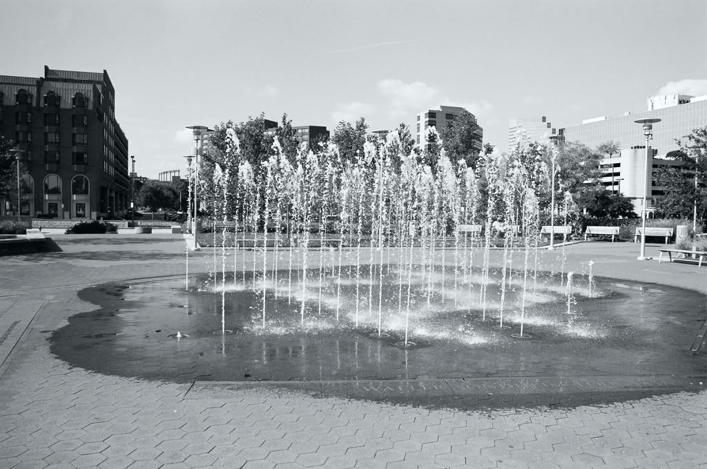
The Walter Sondheim Fountain in Downtown Baltimore, at the Inner Harbor. Please, let me know what you think.
Follow along with the video below to see how to install our site as a web app on your home screen.

Note: This feature currently requires accessing the site using the built-in Safari browser.
")
Ha, that's why I put "RAW" in quotes. I just meant, un-processed.RAW from film? Neat trick
No offense intended on my first post, by the way, just my opinion. It's nice to see someone else shooting film, not many people do these days.
The reason why I guessed that it was a film shot is because the EXIF data lists a Noritsu printer as opposed to a camera. Based on that, I was wondering if this a scan of a print? Or a scan of the neg?
Plus, I bought that X-700, and it's really nice (which is what I took this shot with) and have been getting interested in playing around with film. I'm not sure what you mean by 'blocked up'? I'll have to search through the negs and take a look at it.How does the negative look ?
Are the highlights and shadow areas blocked up?
Kodak "Professional" C41.
Ah, gotcha. I'll take a look at the negs tomorrow.Blocked up ... very dark or light areas on the negative with no other details ... either extreme over or under exposed areas.
I think the contrast of the original has better balance. The water does not get lost in the background as much
A yellow filter would have darkened the blue sky in the background, producing more contrast between it and the clouds.
Ah yes, the X-700 is awesome. I like it, a lot. Plus, I got it for $40!I like your taste in cameras - the X-700 was my first camera, back in the day
I totally agree with your comment about shooting film to improve your work overall, it does make a difference.
Going back to your image, there's two separate "bits" going on - the subject matter/composition, and then the exposure/post processing.
Looking only at the exposure/post processing for now - based on the original scan (from your second post), you did a great job with the exposure - do you see how there is white + black + middle grey in the image? That is good, especially since the white isn't glowing/super bright, and the blacks aren't black holes, so to speak. When you (?) post-processed it in Gimp, you took out the middle greys, and by that the whites got too bright and the blacks got too dark - this is what I meant by too much contrast - all of the details got lost.
Now, if you meant to make the image high-contrast as an artistic choice, that is a different matter - I'm just talking about standard, traditional photography. It is after all your image and you should do whatever you like with it
Ah yeah, I'd definitely like to actually get some real B&W film. I bought this film because I wanted to take some B&W pictures, and also because they were the first rolls being put through the camera...didn't want to waste a bunch of cash on 'good' film, if it wasn't working properly. But as I learn more about monochromatic photography, I will be playing with some more 'professional' film. As for getting it developed easily...there is a camera store near me, that does developing/etc...however, I think they have to do mail-out for anything other than C41.Kodak "Professional" C41.
Kodak BW/T400 CN ?
Dye based B&W films do not have the same contrast as silver based (real) B&W films.
You should try "real" B&W film ... Ilford HP-5, Delta... Efke ... Kodak T-Max, Tri-X ... if you can get it developed easily.
Yeah, so I've read. I am enrolling in a 'Shooting Techniques' class for SLR/DSLR cameras in Jan. The next class I may take might just be the monochromatic course.One thing to remember when shooting B&W ... you have to mentally discard the color when you look at a scene.
You have to see in monochrome ... see everything in tones of blacks, greys and whites.

![[No title]](/data/xfmg/thumbnail/40/40288-4d5d7a8aa74ddfceb5fb82062d9b21be.jpg?1619739409)
![[No title]](/data/xfmg/thumbnail/40/40285-2ce5915035c220ccb3485030863b62d0.jpg?1619739408)
![[No title]](/data/xfmg/thumbnail/33/33359-a5cf76b8e843e82b3831650af6dfa6b3.jpg?1619735923)