1 DSC_0287 by mannyher1, on Flickr 2 DSC_0292 by mannyher1, on Flickr
manny212 No longer a newbie, moving up! Joined Aug 18, 2010 Messages 998 Reaction score 700 Location Miami, Fl. Can others edit my Photos Photos OK to edit Feb 6, 2011 #1 1 DSC_0287 by mannyher1, on Flickr 2 DSC_0292 by mannyher1, on Flickr
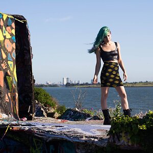
misstwinklytoes TPF Noob! Joined Jun 13, 2010 Messages 2,111 Reaction score 40 Location Texas Website www.etsy.com Can others edit my Photos Photos OK to edit Feb 6, 2011 #2 1. I like, but I think the horizon line is too close to center. 2. Neat, but I think I would have cropped it so that the corks were centered. Def my fav of the 2.
1. I like, but I think the horizon line is too close to center. 2. Neat, but I think I would have cropped it so that the corks were centered. Def my fav of the 2.
Sbuxo TPF Noob! Joined Aug 29, 2008 Messages 973 Reaction score 6 Location somewhere :) Website www.instagram.com Can others edit my Photos Photos NOT OK to edit Feb 6, 2011 #3 1. The clouds ruin it for me, they look more like puffs of smoke. Something you can do, crop out that sliver of impartial building on the left. 2. The background is still really busy despite the difference of depth of field, I think a shallower depth of field would've worked better.
1. The clouds ruin it for me, they look more like puffs of smoke. Something you can do, crop out that sliver of impartial building on the left. 2. The background is still really busy despite the difference of depth of field, I think a shallower depth of field would've worked better.


![[No title]](/data/xfmg/thumbnail/35/35666-9f404fab7b896e4ec114160079fa71c6.jpg?1619737090)

![[No title]](/data/xfmg/thumbnail/31/31035-96228fec87f6f8e8b5f3db4e93e99189.jpg?1619734580)