Waterfalls - C+C

LungFish

TPF Noob!
Joined
Nov 9, 2011
Messages
84
Reaction score
9
Location
Perth
Can others edit my Photos
Photos OK to edit
I've been wanting to do some long exposure waterfall shots for a while but didn't have a decent subject until I visited these two. How did I do?

1) Nikon D5k, Sigma 50/1.4, f/16, 1.6s, ISO 200
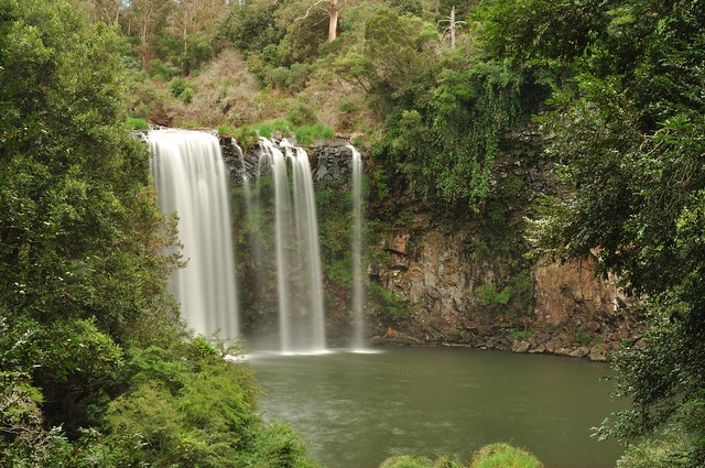

Dangar Falls by clavain1, on Flickr

2) Nikon D5k, Sigma 50/1.4, f/20, 2s, ISO 200
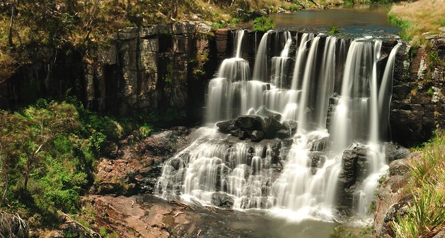

Ebor Falls by clavain1, on Flickr

3) Fuji X100, f/16, 1.5s, ISO 200
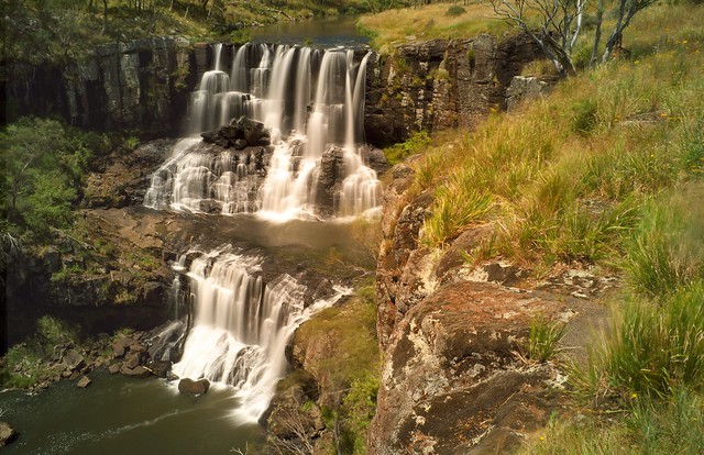

Ebor Falls by clavain1, on Flickr
 
Last edited:
I like 1 and 2 for the veil look, however a bit underexposed, and the greens could have been stronger to give a nicer colour to the picture. 3. is overexposed on 1 side on under exposed on the other.
Also, not sure if you could get closer to the side of the fall, but side shots (at +- 30 angle to the fall or closer) of waterfalls gives you more depth.
 
I like #1. As was said, a bit more exposure, though. On #2 I'd have probably brought up the shot a bit to keep out the little bit of white water on the bottom & add a bit more to the top making it look like one solid fall. I'd also have leveled the waterfall more like you did in the last one. The 3rd I like but just a bit less exposure. Of course, every "I would have" should have the disclaimer: "If I thought of it at the moment."
 
That seems to be it for the comments (thanks TightKnot and Diver_matt), so I did a re-edit based on the above (#1 is actually an entirely different photo taken at the same time). A tweak on exposure and tint, the lower section of the falls removed from #2. The crop on #2 sees a bit crowded to me now.
 
Last edited:
That seems to be it for the comments (thanks TightKnot and Diver_matt), so I did a re-edit based on the above (#1 is actually an entirely different photo taken at the same time). A tweak on exposure and tint, the lower section of the falls removed from #2. The crop on #2 sees a bit crowded to me now.
Number 1 is definitely better now, and I also feel that no. 2 crop feels crowded. It may have been better as a portrait instead of a landscape.
 

Most reactions

Back
Top