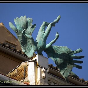
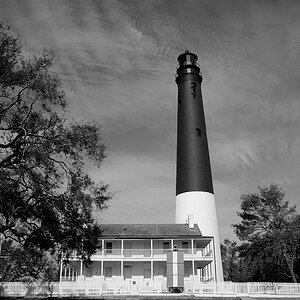
As a known hater of excessive watermarks, I think that the classiest way to identify your work and attempt to generate interest is your name (or that which you wish people to know you as, and MAKE SURE IT COMES UP IN GOOGLE- I am now the first hit for my moderately common name, thanks to a photoblog with daily updates) in small, unornamented, and opaque lettering in the corner. Open up the Text tool, pick a classic font, set the opacity to 60%, and drop it in the corner. That way, people who are impressed will find your name, and those who want to see your photo won't instantly be overwhelmed by a logo in which a dolphin silhouette turns into rising smoke that eventually spells out "DaRk viZZionZZ pHoToZZ" while covering ninety-seven percent of the image.
I have been considering doing the same thing for a series of images I'm sending back to my summer employer (hoping to remind them of how much they love me and why they should invite me back), and this is the classiest-looking thing I can find.
While I like McQueen's advice, this has the added advantage of being visible on a hung photograph, since most of the people who see your images will almost assuredly never see the back of the print. Ultimately, I think the best choice depends on who the images are going to and how they will be using them (shoved in a folder or hung in a high-traffic area?). KISS- Keep It Subtle Stupid are words I wish more watermarkers would live by.






![[No title]](/data/xfmg/thumbnail/37/37126-93feffeca0e9e6ad893962c03a7a341e.jpg?1734169833)
![[No title]](/data/xfmg/thumbnail/37/37125-c083e505c2e7d8f15f717a96de782959.jpg?1734169833)

![[No title]](/data/xfmg/thumbnail/37/37129-2b15d9f6bc8d43c2c1247a6c591d14aa.jpg?1734169834)
![[No title]](/data/xfmg/thumbnail/37/37128-189b79232a3c6bf0c2c530e4eea0b8cd.jpg?1734169834)