Website portraits portfolio

3bayjunkie

TPF Noob!
Joined
Jan 4, 2011
Messages
576
Reaction score
12
Location
United States of America
Website
www.colbyjack.com
Can others edit my Photos
Photos NOT OK to edit
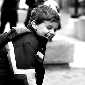
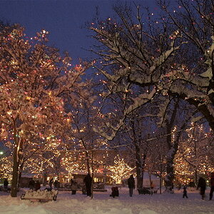
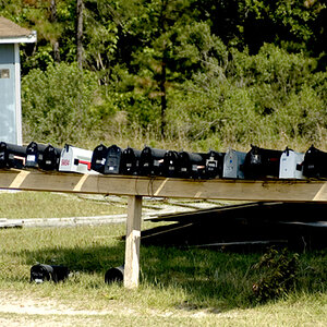
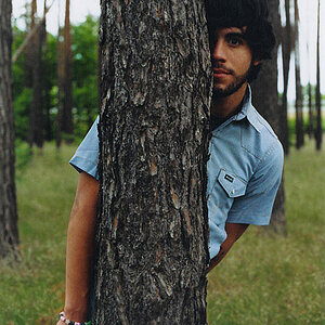
Could you all please take a look at and comment on my portraits. Mainly the kids section. Im trying to get more clients but would love some comments and critiques.

Just so you know im aware of most all of my cropping mistakes, but use your judgement with the criticism. Really appreciate it.

See signature for web link. Thanks again!
 
Last edited:
I think your website is clean, but it's lacking zest. I feel that it does not give ENOUGH information (like the types of sessions you offer, what you give, how much they cost, etc). Your bio says "I" too much. I wish that your photos either were large that you could just scroll through, or automated in a flash type slide show.
 
PinkDoor said:
I think your website is clean, but it's lacking zest. I feel that it does not give ENOUGH information (like the types of sessions you offer, what you give, how much they cost, etc). Your bio says "I" too much. I wish that your photos either were large that you could just scroll through, or automated in a flash type slide show.

Actually you can scroll through each set if you click on one photo in the set. And i really just wanted critiques on my kids photos. Thanks anyway.
 
Last edited by a moderator:
Your style seems to be low contrast, low punch - and I think that makes the images unexciting.

You have only two kids showing but the first row has lots of variety while the second has the same vivid dress. That says few customers, inexperience
Use all of the first row, and pick one from the second, Use those 6, add a face shot or two and punch some colors so that there is a variety.

Lew
 
For best critique please post 1-4 images in this (or a new) thread rather than trying to direct traffic to your website. It saves members from clicking outside links and ensures that we comment on the images you most want critique on.

Thanks.
 
tirediron said:
For best critique please post 1-4 images in this (or a new) thread rather than trying to direct traffic to your website. It saves members from clicking outside links and ensures that we comment on the images you most want critique on.

Thanks.

Well the point was that i wanted to know how the photos looked on the website and layout as well as how they look individually. So that is why i wanted you to look at them ON the website. To get an overall idea of my style. Im waiting on my developing kit so i can develop my b&w as no place near me does b&w developing.

<The link in your signature is sufficient>
 
Last edited by a moderator:
Well the point was that i wanted to know how the photos looked on the website and layout as well as how they look individually. So that is why i wanted you to look at them ON the website...
You're asking for two different things. If you'd like website review, I will be happy to move your thread to the Websites Forum, but if you want photographs critiqued then your best results will be realized by embedding images within a thread.
 
Ok i see how youre looking at it, but i dont want to make it too complicated. Just how do the photos look on the site layout. Thats all im asking. What are your thought on the overall presentation and style of shooting. Trying to make my photos appeal to the right people, im not really looking to change my processing method.

Pretty much just want people to get an overall feeling for the whole package and give me some feedback. Thanks again for commenting


< The link in your signature is sufficient>
 
Hey sorry everyone for having the double signature. Maybe one of the moderators can fix it in the app. There is a signature setting for the app. I turned off my app signature, but no one told me i had two signatures!!! Someone should have said something sooner instead of getting mad at me. You know you cant see any signatures on the iphone app except for your app signature...

Who creates this app? Maybe they should work out that bug.
 
I know I am just starting in photography, and am learning myself, so please take this with a grain of salt. I find that the noise in the images to be distracting. Insead of a nice smooth background, the noise is staring at me, which makes it look more "harsh" if you can see what I am saying. It also plays into the portraits of Rayana making her skin look kind of blemeshed in a couple of the shots. I like the photos, I just think that perhaps a little noise removal to smooth everything out would help give them a more polished look. Just a thought.
 
I looked ast the kids. they are nice. Liked the muted colors. Reminded me of Michal Chelbin's stuff a little.
 
Last edited by a moderator:
Sorry, didn't realize the noise was intentional and what you were going for. I guess then my only suggestion is add some shot of the kids without noise for those who may not understand/want that style of photography. It also gives you a good way to showcase how dynamic you are as a photographer.
 
jubbin2001 said:
Sorry, didn't realize the noise was intentional and what you were going for. I guess then my only suggestion is add some shot of the kids without noise for those who may not understand/want that style of photography. It also gives you a good way to showcase how dynamic you are as a photographer.

I appreciate your input and actually you are on the right track. It may have more grain than normal but it mostly to blame low resolution scans. They are from the cd my photo processor gave me. If i wanted high res they are $2 per frame, but my negatives scanner is on its way to me in the mail so ill fix that soon. Good observation!
 
Wow I just looked back at the thread and I have to apologize. I am fighting a bad cold and was on a bunch of meds, and realized my reply was not actually directed at the OP, but at another user. Sorry for that. Good luck with the slide transfers. I look forward to seeing them!
 

Most reactions

Back
Top