Cheex
TPF Noob!
- Joined
- May 7, 2011
- Messages
- 75
- Reaction score
- 27
- Can others edit my Photos
- Photos NOT OK to edit
Any comments appreciated!
1.
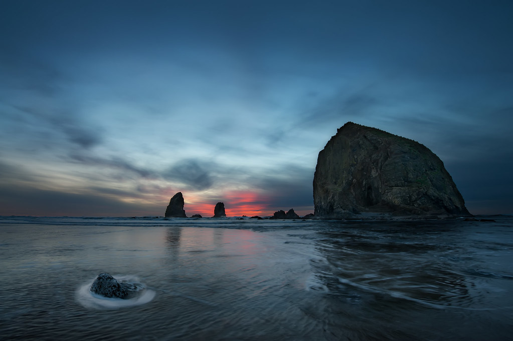
Canon Beach 1.1 by Chodie89, on Flickr
The rock on the left could be photoshopped out... still debating it. Anyone feel strongly one way or the other?
2.
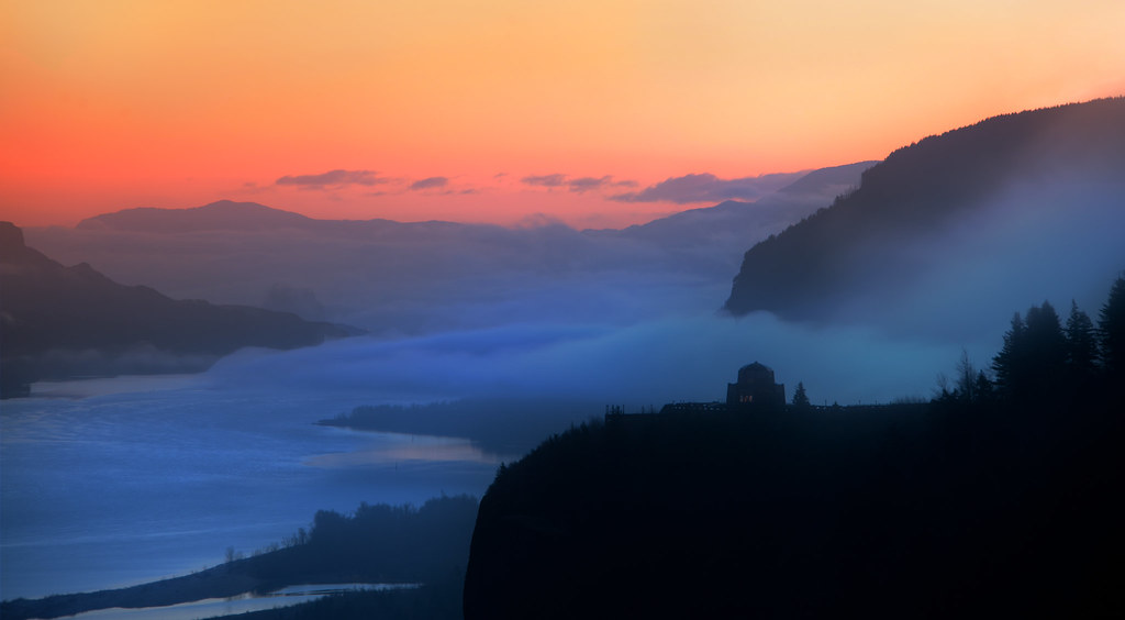
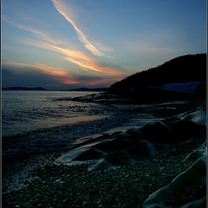
Columbia River Gorge Daybreak 12.31.11 by Chodie89, on Flickr
Added a ton of color to the sky. Does it look unnatural? =p
3.

grotto by Chodie89, on Flickr
Not much done to this photo... just a Christmas capture
4.
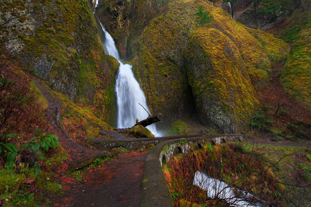
Wahkeena falls by Chodie89, on Flickr
Possibly darkened the tone a little too much. thoughts?
5.

California Beach by Chodie89, on Flickr
My attempt to salvage a late sunset 10sec exposure... probably too dark for any real merit.
Again, all comments and criticism welcome!
1.
Canon Beach 1.1 by Chodie89, on Flickr
The rock on the left could be photoshopped out... still debating it. Anyone feel strongly one way or the other?
2.
Columbia River Gorge Daybreak 12.31.11 by Chodie89, on Flickr
Added a ton of color to the sky. Does it look unnatural? =p
3.
grotto by Chodie89, on Flickr
Not much done to this photo... just a Christmas capture
4.
Wahkeena falls by Chodie89, on Flickr
Possibly darkened the tone a little too much. thoughts?
5.
California Beach by Chodie89, on Flickr
My attempt to salvage a late sunset 10sec exposure... probably too dark for any real merit.
Again, all comments and criticism welcome!


 lol
lol


![[No title]](/data/xfmg/thumbnail/34/34060-c81fb16d207094738be9b89a70ae1331.jpg?1734164477)

![[No title]](/data/xfmg/thumbnail/34/34056-de7cd932b4cd702c2f77e0f5c9ec1aa2.jpg?1734164470)