crls_santino
No longer a newbie, moving up!
- Joined
- Sep 8, 2014
- Messages
- 106
- Reaction score
- 33
- Thread Starter 🔹
- #31

--------
no signature


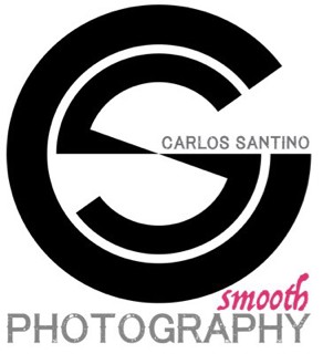
I have no clue what smooth photography is
right, as you see i am not english, and i need some reference point, its kind of survey how 'professionals' receive this sings, or normal user potential customer, how do you read smooth? enigmatic, or cheap trick, i am trying to find the way to create proper bunch to get all business/marketing on my site. there are some ideas behind all what i want to put together. this is aspiring professional area that i count on your experience and opinions if you don't mind
--------
no signature
sure, i will consider more sharp wordplay.Well smooth is generally considered the opposite of sharp, so probably not the best wording choice since sharp is something people desire in pictures they are paying money for in most cases. I'm not sure what you are wishing to convey with the word "smooth" but if can elaborate maybe we can suggest some better alternatives.
Thank you Watchful,When you decide on your logo make a very large one and then save it as an eps vector file so it will be saved as curves and not as pixels so it scales to any size easily.
If you like, I'll help you work one up. I do that for a living and will help you for free as one starving artist to another.
Shapes of CS are done, I do not want to move out letters as there are disturbing. Returning to 'smooth' following cambridge dictonary: having a surface or consisting of a substance that is perfectly regular and has no holes, lumps, , happening without any sudden changes, interruption, or difficulty, very polite, confident, and able to persuade people.I like the last best, but not particularly the location of your name. Smooth doesn't get me all excited ... but I see your point of separating yourself from the masses. In that regards Smooth works. I recommend you trademark "Smooth Photography", name the company Smooth Photography and name your web site Smooth Photography. The pink, doesn't do a lot for me, but I understand the desire for contrast. While the pink is flashy, it also is weak and does not convey strength or solid especially in that font. I'd make "CS" a bit smaller, toss your name over PHOTOGRAPHY and find a color and font equally or near equally as eye-catching but a bit more solid.
Or go horizontal, a smaller CS on the left, Carlos Santino inserted into the C of the CS and Smooth Photography on the right ... or even reverse that again a smaller CS but on the right with Smooth Photography two line, flush right, on the left.
Remember in marketing, when people will only see something for a few seconds, less is more.

Thank you Watchful,When you decide on your logo make a very large one and then save it as an eps vector file so it will be saved as curves and not as pixels so it scales to any size easily.
If you like, I'll help you work one up. I do that for a living and will help you for free as one starving artist to another.
I am working with AI that everything is vector, wordpress and most browsers cannot read eps files, that I have be careful with the letter size or composition to be visible when is small.
The word you are looking for is 'professional'Shapes of CS are done, I do not want to move out letters as there are disturbing. Returning to 'smooth' following cambridge dictonary: having a surface or consisting of a substance that is perfectly regular and has no holes, lumps, , happening without any sudden changes, interruption, or difficulty, very polite, confident, and able to persuade people.I like the last best, but not particularly the location of your name. Smooth doesn't get me all excited ... but I see your point of separating yourself from the masses. In that regards Smooth works. I recommend you trademark "Smooth Photography", name the company Smooth Photography and name your web site Smooth Photography. The pink, doesn't do a lot for me, but I understand the desire for contrast. While the pink is flashy, it also is weak and does not convey strength or solid especially in that font. I'd make "CS" a bit smaller, toss your name over PHOTOGRAPHY and find a color and font equally or near equally as eye-catching but a bit more solid.
Or go horizontal, a smaller CS on the left, Carlos Santino inserted into the C of the CS and Smooth Photography on the right ... or even reverse that again a smaller CS but on the right with Smooth Photography two line, flush right, on the left.
Remember in marketing, when people will only see something for a few seconds, less is more.
How to in one word tell the people you doing well, on the time, and you know what you doing?
Have a good weekend

