You are using an out of date browser. It may not display this or other websites correctly.
You should upgrade or use an alternative browser.
You should upgrade or use an alternative browser.
what do you think?
- Thread Starter lalo56
- Start date
lalo56
TPF Noob!
- Joined
- Aug 9, 2010
- Messages
- 39
- Reaction score
- 0
- Thread Starter 🔹
- #2
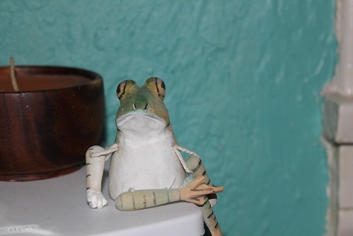
In my opinion, they're all lacking in contrast. #2 and three seem to me like they might be a smidge overexposed. There also doesn't really appear to be any real thought to composition in any of them.
Keep shooting and practicing. You'll get it. :sillysmi:
Thanks. I will keep that in mind.
- Joined
- Jun 19, 2009
- Messages
- 13,661
- Reaction score
- 4,898
- Location
- In your dreams!
- Can others edit my Photos
- Photos OK to edit
- Moderator 🛠️
- #3
Just somethings to keep in mind.......Please don't take this link as a say all!! Rules are made to be broken but that being said it will give you a nice idea of what makes a nice picture.
Learn and then break them as much as you want!!!
10 Top Photography Composition Rules | Amateur Snapper
Learn and then break them as much as you want!!!
10 Top Photography Composition Rules | Amateur Snapper
lalo56
TPF Noob!
- Joined
- Aug 9, 2010
- Messages
- 39
- Reaction score
- 0
- Thread Starter 🔹
- #4
Just somethings to keep in mind.......Please don't take this link as a say all!! Rules are made to be broken but that being said it will give you a nice idea of what makes a nice picture.
Learn and then break them as much as you want!!!
10 Top Photography Composition Rules | Amateur Snapper
Cool thanks. I will read that as well as getting a magazine i saw and liked, named Photography.
Yeah sometimes i may capture something that motioned me to and may not others.
csgrafix
TPF Noob!
- Joined
- Mar 12, 2010
- Messages
- 103
- Reaction score
- 0
- Location
- New York
- Can others edit my Photos
- Photos OK to edit
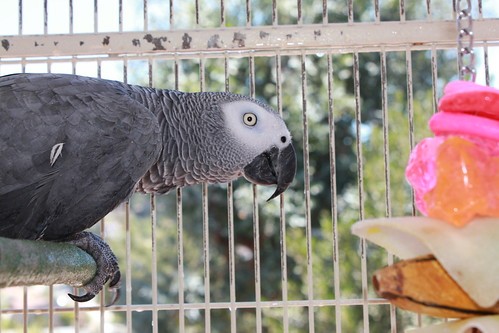
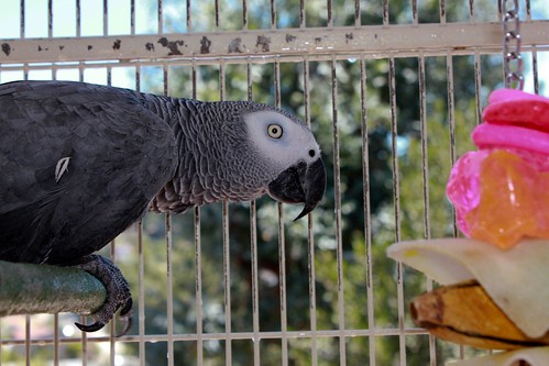
Nice bird... and your edit did improve the color saturation, but I think you can improve more with what goes with the main subject. As in.. background and what the subject is leading to.
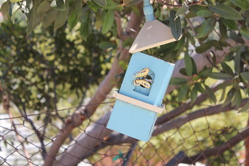
#3 nice DOF i think... but what is that box ?
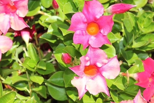
#4 overexposed... -1 or -1.5 exposure comp. ?
#3 nice DOF i think... but what is that box ?
#4 overexposed... -1 or -1.5 exposure comp. ?
Last edited:
lalo56
TPF Noob!
- Joined
- Aug 9, 2010
- Messages
- 39
- Reaction score
- 0
- Thread Starter 🔹
- #7
Nice bird... and your edit did improve the color saturation, but I think you can improve more with what goes with the main subject. As in.. background and what the subject is leading to.
Thanks. He was not leading to anything just a bit weary of the camera. I do understand. Every comment helps me improve.
csgrafix
TPF Noob!
- Joined
- Mar 12, 2010
- Messages
- 103
- Reaction score
- 0
- Location
- New York
- Can others edit my Photos
- Photos OK to edit
Nice bird... and your edit did improve the color saturation, but I think you can improve more with what goes with the main subject. As in.. background and what the subject is leading to.
Thanks. He was not leading to anything just a bit weary of the camera. I do understand. Every comment helps me improve.
I just got a baby conure several weeks ago and still havent a decent photo. Big difference when you got this big lens in play.
lalo56
TPF Noob!
- Joined
- Aug 9, 2010
- Messages
- 39
- Reaction score
- 0
- Thread Starter 🔹
- #9
Nice bird... and your edit did improve the color saturation, but I think you can improve more with what goes with the main subject. As in.. background and what the subject is leading to.
Thanks. He was not leading to anything just a bit weary of the camera. I do understand. Every comment helps me improve.
I just got a baby conure several weeks ago and still havent a decent photo. Big difference when you got this big lens in play.
I love Conures, nice colors and good birds if you spend alot of time with them. Like any other bird i guess.
Polyphony
TPF Noob!
- Joined
- Jun 25, 2010
- Messages
- 336
- Reaction score
- 0
- Location
- New York
- Can others edit my Photos
- Photos OK to edit
- Banned
- #10
I like the picture of the bird. The cage in the background is a little distracting. If you could get closer to it and use a shallow depth of field (large aperture) I think the image would be even better because it would isolate the bird from the background.
lalo56
TPF Noob!
- Joined
- Aug 9, 2010
- Messages
- 39
- Reaction score
- 0
- Thread Starter 🔹
- #11
Nice bird... and your edit did improve the color saturation, but I think you can improve more with what goes with the main subject. As in.. background and what the subject is leading to.
#3 nice DOF i think... but what is that box ?
#4 overexposed... -1 or -1.5 exposure comp. ?
I agree with you. My fiance was taking these pictures. With what little i taught her with the little know... I think she did good. With a little Light Room work makes for a better picture for some. The flowers are over exposed, but can be fixed. I just dont want to try to.
#3 is a bird feeder. Not a good shot since obviously did not appeal you.
4# I agree...
Thanks for your CC. We both will learn.
BuS_RiDeR
No longer a newbie, moving up!
- Joined
- Oct 29, 2009
- Messages
- 2,355
- Reaction score
- 83
- Location
- Riverview, New Brunswick, Canada.
- Can others edit my Photos
- Photos OK to edit
I think the edit of the bird is quite an improvement. The bird is my favorite of what you posted... However I feel that it might benefit by a recrop... So only the bird is in the frame... The orange thingy is distracting my eyes a bit. But maybe thats just me.
lalo56
TPF Noob!
- Joined
- Aug 9, 2010
- Messages
- 39
- Reaction score
- 0
- Thread Starter 🔹
- #13
I think the edit of the bird is quite an improvement. The bird is my favorite of what you posted... However I feel that it might benefit by a recrop... So only the bird is in the frame... The orange thingy is distracting my eyes a bit. But maybe thats just me.
Thanks... I cropped it that way only because thats his favorite toy.
BuS_RiDeR
No longer a newbie, moving up!
- Joined
- Oct 29, 2009
- Messages
- 2,355
- Reaction score
- 83
- Location
- Riverview, New Brunswick, Canada.
- Can others edit my Photos
- Photos OK to edit
Thanks... I cropped it that way only because thats his favorite toy.
Well that makes sense.
Similar threads
- Replies
- 1
- Views
- 353

![[No title]](/data/xfmg/thumbnail/39/39193-6ebc8ca9478a68b5fe2120c2163f40d3.jpg?1734173069)

![[No title]](/data/xfmg/thumbnail/37/37170-3e18af574ed51cce5bdf99af9d3cab40.jpg?1734169892)


![[No title]](/data/xfmg/thumbnail/35/35870-e324e80cd11d99176357e12cd2ba3b8a.jpg?1734167596)

