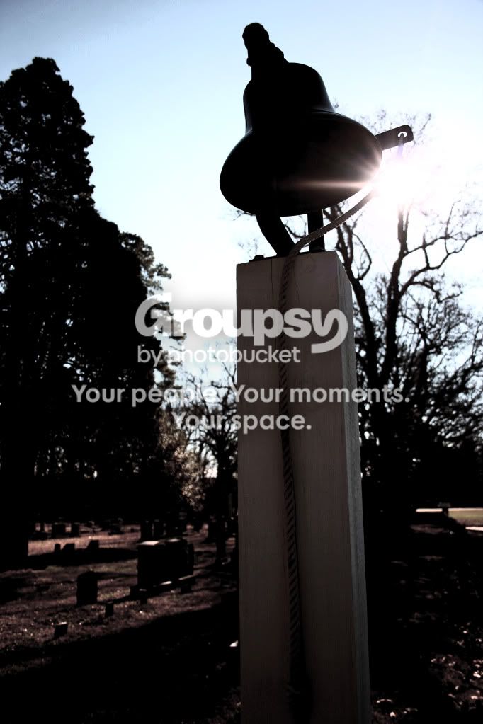
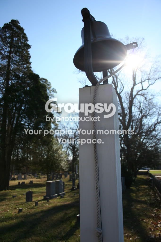
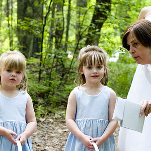
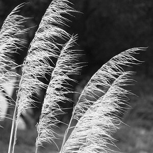
I dont like either of them, the dark one is too overexposed. the second one is too soft. It might have been better if you had the sun hidden behind the bell so the sun would not blind you. Also while the background seems to be level, the angle of the picture makes the bell post look crooked, which does not look right.