What would you do?

Mikeyb90

No longer a newbie, moving up!
Joined
Feb 9, 2013
Messages
126
Reaction score
34
Location
Ohio, US
Can others edit my Photos
Photos OK to edit
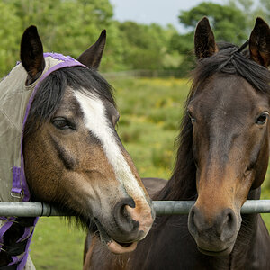
#1 and #2 are from my friends surprise engagement /birthday party. They loved the pics of the special moment but I'm curious as to what I could do to make these photos "pop" in post. Obviously the background wasn't desirable so I blurred it more and it was a last minute thing so this is what I went home with. What would you do? #3 is a from a set of Christmas pics I took for a family. I took this picture in particular to practice different photoshopping skills. My idea was to make the tree have lights and ornaments and make it more festive. How do I go about this? I always see stuff like it online and I'm wondering how to get there.. Fake snow and stuff of that nature, you know, to give it that Christmas feeling :icon_santa:

Thanks in advance for any advice!

1.
_DSC1462.jpg

2.
_DSC1467(2).jpg

3.
_DSC1352.jpg
 
I wouldn't try to do anything with the first two. The pictures are special to them because of the spontanious moment they captured. Instead, set up a time to take engagement pictures in a more controlled environment. Plan out your location, time of day, lighting, equipment, etc. ahead of time and you will have less work to do in post production to make a great portrait.

Regarding the last picture, there are a ton of tutorials on how to create lights and snow. My advice would be to shoot the family tighter with the tree(s) farther away in the background. Perhaps the family could move to one side of the shot exposing a Christmas scene in the distance. You can still add lights and snow but the focus should be on the family.

Sent from my SM-N920T using Tapatalk
 
I suggest all these photos need is some basic editing.

I opened all 3 photos in ACR - Adobe Camera Raw.
Adobe Photoshop Camera Raw and the Develop module in Lightroom are both ACR.

In ACR I made the same edits to all 3 photos:
First I used the White Balance tool (eyedropper) to set the white balance of each photo. I used the white window frame over his shoulder in 1492 and the white board in 1467(2). I used the man's tee shirt there under his chin in 1352.
Next I used 2 of the 3 "Presence" sliders (Clarity, Vibrance, Saturation) in the Basic panel. I added +30 of Clarity, which boosts mid-tone contrast, and +30 of Vibrance.
I then opened the Sharpening panel and set the sharpening to Amount 25, Radius 1.2, Details 25, Masking 0.

I then opened the 3 photos in Photoshop.
All I did in Photoshop was to crop each photo and add a narrow black border.

_DSC1462.jpg


_DSC1467(2).jpg


_DSC1352.jpg
 
Keiths edits look spot on. Compositionally, I can see them through the "clients" eyes and they are perfect.

The last could have been taken at a better time of day to improve.


p!nK
 
KMH's edited shots are very good, but the embrace and kiss shot would be better cropped additionally, at the bottom and right hand side. Note how very MUCH stronger KMH made the tree shot? Cropped it heavily: eliminate the wood moulding in the kiss, and crop the bottom right below his hand on her hip.
 
I suggest all these photos need is some basic editing.

I opened all 3 photos in ACR - Adobe Camera Raw.
Adobe Photoshop Camera Raw and the Develop module in Lightroom are both ACR.

In ACR I made the same edits to all 3 photos:
First I used the White Balance tool (eyedropper) to set the white balance of each photo. I used the white window frame over his shoulder in 1492 and the white board in 1467(2). I used the man's tee shirt there under his chin in 1352.
Next I used 2 of the 3 "Presence" sliders (Clarity, Vibrance, Saturation) in the Basic panel. I added +30 of Clarity, which boosts mid-tone contrast, and +30 of Vibrance.
I then opened the Sharpening panel and set the sharpening to Amount 25, Radius 1.2, Details 25, Masking 0.

I then opened the 3 photos in Photoshop.
All I did in Photoshop was to crop each photo and add a narrow black border.

View attachment 131623

View attachment 131624

View attachment 131625

Thank you very much for the advice and taking the time to show me what you're talking about. I think #1 looks quite a bit better. #2 I don't know if its just me, but I think the clarity slider gives the skin too much texture. I hardly ever go more than 5 or 6 on the clarity. It makes it look too....overly processed for my taste. I also used the white dropper on the window frame but it looked too cool to me so I warmed it up a tad. What do you mean by 1492, 1467 etc..? #3 I was more curious about some sort of winter/christmas effects I could add to it. I think that the crop looks way better but to me as a whole it just looks over processed.
 
Keith should be applauded for explaining step by step what he did to improve the photos. All too often whizz bang post processors whip up something slick and say there look how I improved your photo. Nothing to learn from that.
 

Most reactions

New Topics

Back
Top