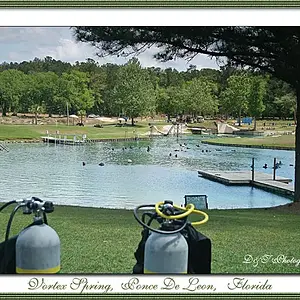
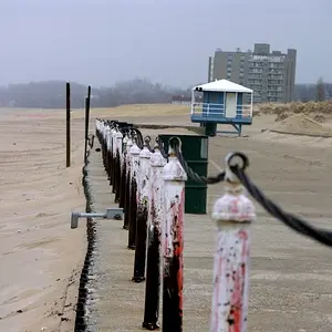
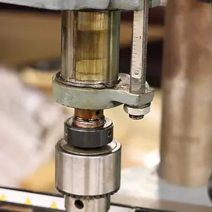
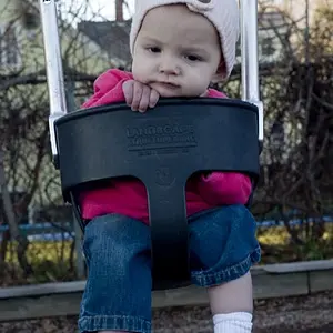
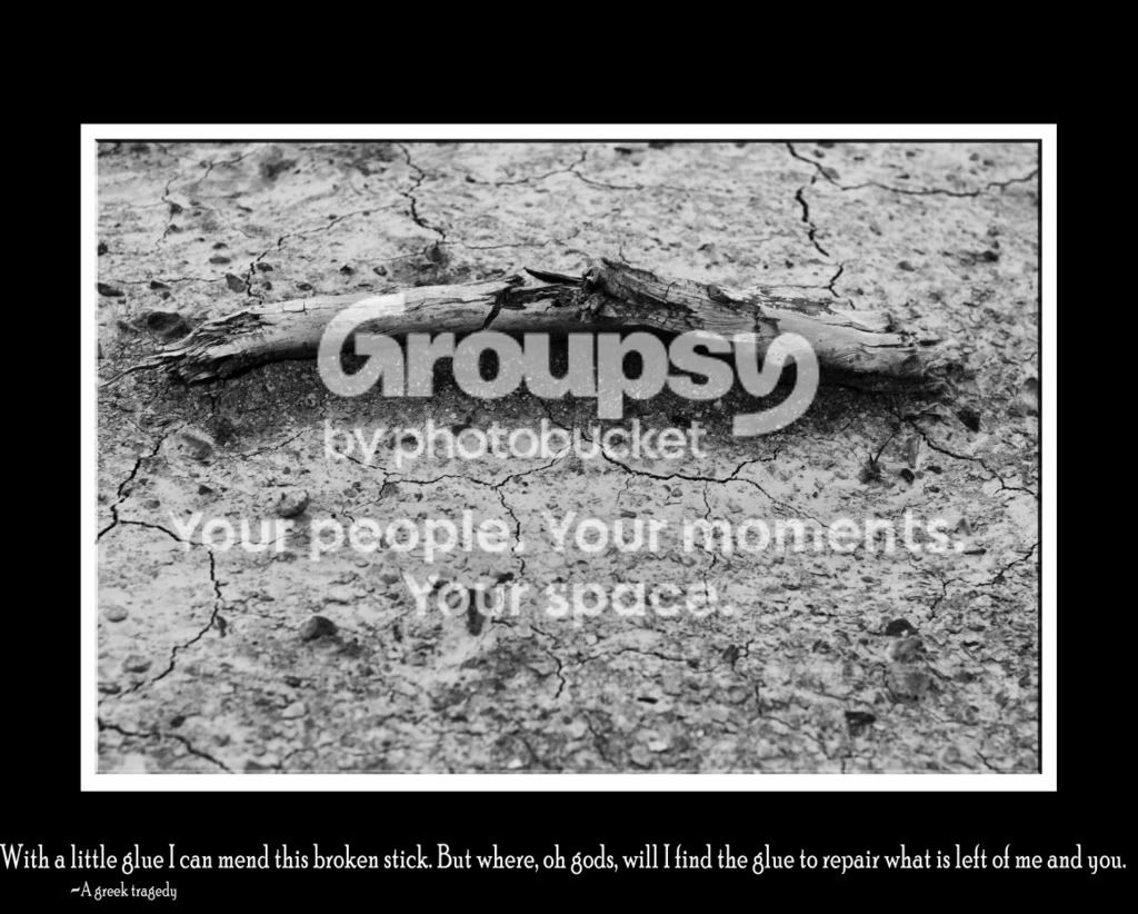
i love the shot, if it was more crisp like u said it would be great... maybe a little darker and/or more contrast would be good
and the text at the bottom would be better for me if it was a little smaller so it fit under the pic and it was a more interesting font like a light cursive...
love the idea and the results!




![[No title]](/data/xfmg/thumbnail/41/41765-153b10bab62ae8adbcc4d984fd08ed74.jpg?1734176069)