Garbz
No longer a newbie, moving up!
- Joined
- Oct 26, 2003
- Messages
- 9,713
- Reaction score
- 203
- Location
- Brisbane, Australia
- Website
- www.auer.garbz.com
- Can others edit my Photos
- Photos NOT OK to edit
Hi all
This post serves 2 purposes firstly to Critique my photoshop skills / camera skills and secondly to address which image would go better in the wall of my room.
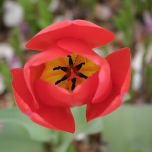
I took this image a few months ago and posted it (the color one) a day later someone else posted something more fantastic and someone posted a great idea to combine black / white and the colors.
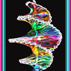
The problem is that with the inverted image i think it stands out too much and steals focus form the color, and the half inverted image has that border around it which also distracts a bit. EIther way the right image is the image of focus and it's kinda disturbing.

And the alternative

The larger images are linked and about 80k each. THe original image has a resolution over 6000 pixels wide and i was going to send it to snap printing to make a poster about 80cm long but i'm not final on the dimensions.
Basically what do you think, is there some way i can make it better?
This post serves 2 purposes firstly to Critique my photoshop skills / camera skills and secondly to address which image would go better in the wall of my room.
I took this image a few months ago and posted it (the color one) a day later someone else posted something more fantastic and someone posted a great idea to combine black / white and the colors.
The problem is that with the inverted image i think it stands out too much and steals focus form the color, and the half inverted image has that border around it which also distracts a bit. EIther way the right image is the image of focus and it's kinda disturbing.

And the alternative

The larger images are linked and about 80k each. THe original image has a resolution over 6000 pixels wide and i was going to send it to snap printing to make a poster about 80cm long but i'm not final on the dimensions.
Basically what do you think, is there some way i can make it better?


 Sorry
Sorry