DarkEyes
TPF Noob!
- Joined
- Jun 14, 2004
- Messages
- 269
- Reaction score
- 2
- Location
- Middle of Nowhere, Oz.
- Website
- img78.photobucket.com
- Can others edit my Photos
- Photos NOT OK to edit
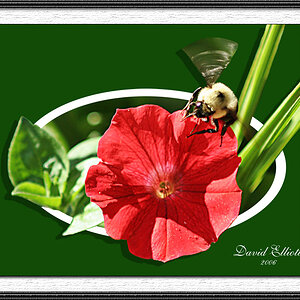
Nead help designing a business card. Here's my first effort, I will post more later. As many ideas as possible will be apreciated.
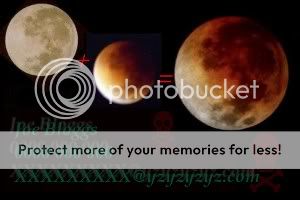
please be aware the image appears much brighter in my ohto editing programs than it does when loaded onto the net.
For a better view, check out this link:
http://img78.photobucket.com/albums.../New Pictures/?action=view¤t=BC_Dud.jpg
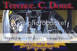
please be aware the image appears much brighter in my ohto editing programs than it does when loaded onto the net.
For a better view, check out this link:
http://img78.photobucket.com/albums.../New Pictures/?action=view¤t=BC_Dud.jpg


![[No title]](/data/xfmg/thumbnail/32/32715-2fc6326453c7dda13dae0bbb0cc16864.jpg?1619735620)


![[No title]](/data/xfmg/thumbnail/38/38734-a0c4ec46a440db881aca3700b0c62879.jpg?1619738703)