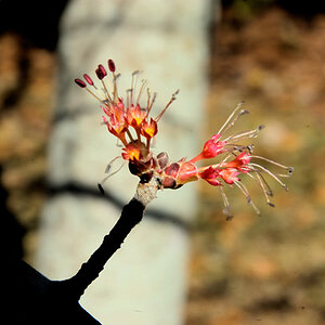
Definitely the second one, I just feel like this pastel style doesn't do the rose justice. I'd rather do a black and white with color accent than turned it pastel tbh.
Definitely the second one, I just feel like this pastel style doesn't do the rose justice. I'd rather do a black and white with color accent than turned it pastel tbh.

![[No title]](/data/xfmg/thumbnail/39/39224-aa3271aa220fe57f37caf898b6984846.jpg?1619738926)


![[No title]](/data/xfmg/thumbnail/41/41796-690c109012575e084970902dbd3894ba.jpg?1619739896)