Which for my portfolio?

Which do you like best (for a portfolio)?

  • 1

    Votes: 1 10.0%
  • 2

    Votes: 3 30.0%
  • 3

    Votes: 5 50.0%
  • 4

    Votes: 1 10.0%

  • Total voters
    10
  • Poll closed .

photong

Typo Queen
Joined
Aug 7, 2003
Messages
1,235
Reaction score
5
Can others edit my Photos
Photos NOT OK to edit
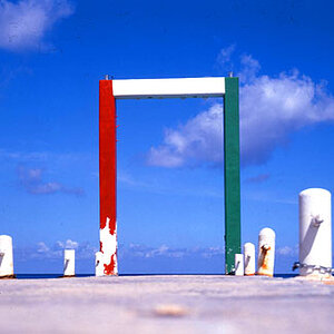
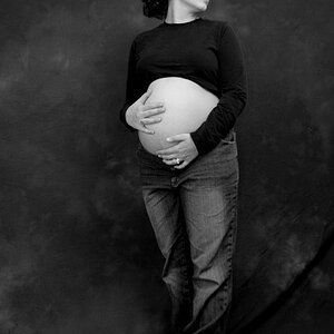
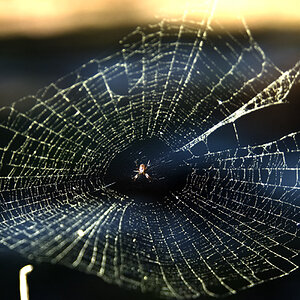
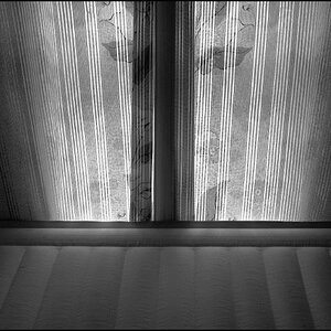
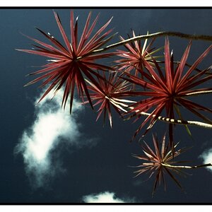
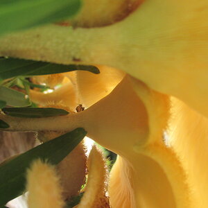
I'd like one of these to be in my portfolio. I have chosen one, but someone suggested a poll because they think either the one I chose or one or two of the others may be good as well (and he gave reasons)

So please vote, and give an opinion as to why not the others, or why you chose the one you did etcetc if you can. it will be very helpful since I don't know any ebtter.

Taken with my Grandpa's D70. I don't think I touched them in Photoshop too much. maybe the contrast because the flash wasn't too nice to me the whole time. Maybe even sharpened. I really don't remember :lol:

I got 4x6 prints of each and they all look awesome!!

Thank you!!! :hug:::hug:::hug:::hug:::hug::

1)
ftf1.jpg


2)
ftf2.jpg


3)
ftf3.jpg


4)
ftf4.jpg

 
Photong mate...some of these would look amazing in black and white...and its a hard choice...nice work mate...made me proud :)
 
Like this Arty?

ftf1bw.jpg


ftf2bw.jpg


ftf3bw.jpg


ftf4bw.jpg


Would it really be appropriate in a portfolio as a BW?


I forgot to go get the one my boyfriend liked that I thought was too busy. I'm a tad lazy right now...

Alright!! Who voted number two!?! Now you've gone done confused me :( I like it, but it doesn't really say or look 'industrial' or 'factory' to me.
 
Only looking at the colour photos, I picked the first. There is just something about the control panel in the shot that does it for me.

Then I looked at the b&w, and damn, I like them all that way.

As far as having b&w in your portfolio, heck a good photo is a good photo, b&w or colour.
 
I voted for number three, I like the perspective in that shot. The black and white are great :thumbup:
 
Two and three are the best, I think. I prefer number three because it has more going on. I'd just like it to be rotated clockwise so that the horizontal beams are true.
Good call on the B&W Dan. They do look better like that.
 
I like #2 It exhibits height and weight, in which translates to how grand the subjects are.
 
oh wow....you guys are awesome and making this REALLY HARD FOR ME! man oh man.....what to do..which to pick....

maybe i'll print them all. except the one I like the least...and ill print the BW versions...hmm..sounds good to me. :)

Thank you :hail:
 
I prefer #2 for its simplicity, composition and lighting. But there are two things about it that, for me at least, could be improved easily. First, a crop to either the top or bottom so that the distance from the stacks to the edge of photo is not equal on both the top & bottom. Second, tone down that bright spot at the top right (especially in the B&W version).

Second favorite is #3 for its vanishing point perspective which adds visual interest and impact.

I like both 3 & 4, but they seem tilted down to the left to me. I also like both the color and B&W versions of all shots, but prefer the color.

Hope this helps.
 
BLS said:
Second favorite is #3 for its vanishing point perspective which adds visual interest and impact.

First, a crop to either the top or bottom so that the distance from the stacks to the edge of photo is not equal on both the top & bottom. Second, tone down that bright spot at the top right (especially in the B&W version).

Thank you for your opinion :)

As for th VP my boyfriend mentioned that too. But I agree with him that even that needs to improved (different angle or something). But there wasn't anywhere I could go to achive a better angle :( Anyhow.

When I print these they will be cropped. I have to elave enough room because if I crop in camera and make an 8x10, valuble info will be lost :( This is a lesson I learnt this past week.

Number 3 is my favourite one. BW and colour. The colour in the prints look a lot better than on (at least mine) a monitor.

I like number two as a BW becuase the colour has too much brown from all the cardboard and it's all I can see. As a BW, it has that contrast and you can see the lines better (I like lines)

I don't really like number 1. It only has meaning to me because I (and my boyfriend. My Dad worked on the one you can't really see to the left because it's a HUGE machine when he was aged 16-18) worked at that machine a few years ago.

I first liked number 4 the most, then my Mom pointed out that 3 looked more like a factory which is what I wanted.

I'm going to get colour and BW of them all and the ones I don't like/use I'm giving to my place of work for them to use ;)

Expect more pictures of this place this Summer.

Thank you again everyone.
 

Most reactions

New Topics

Back
Top