Thanks for the critique everyone.
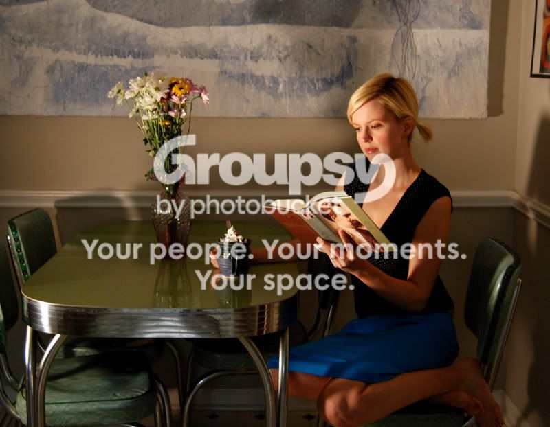
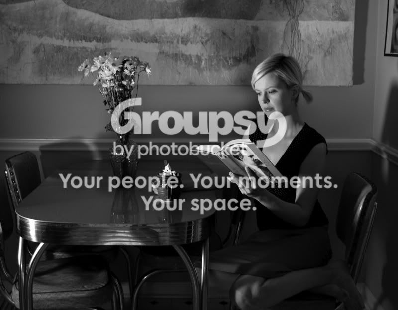
It seems like the color is getting a few more votes, but I've suddenly remembered that I'm supposed to be making a 3 spot color brochure. That pretty much rules out the color photo, at least the way it is now. I'd done the basic layout a while ago and since then I'd forgotten all the rules.

Anyway, I really think the B&W fits the overall theme better anyway.
I probably could have used another item or two on the table, but I didn't want to clutter it up too much. The photo will be pretty small inside a brochure. When you shrink things down, negative space between objects shrinks as well and it can become unreadable, or blob-like. That was my reasoning anyway.
Thanks again for the comments. It helps a lot to hear opinions from real photographers. You point out things that may be obvious, but because I'm focusing on something else, I overlook it. For example, I have no idea why I didn't turn the cup so that the handled faced another direction. And the focus is a little off on her face.

Oh well, I'll remember next time.
--scott



 .
. 


![[No title]](/data/xfmg/thumbnail/41/41490-6af71315284539e04ae1878cda0d613f.jpg?1734175883)