Which one?

metroshane

TPF Noob!
Joined
Apr 30, 2003
Messages
615
Reaction score
2
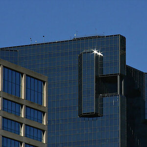
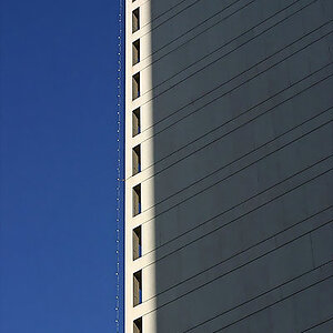
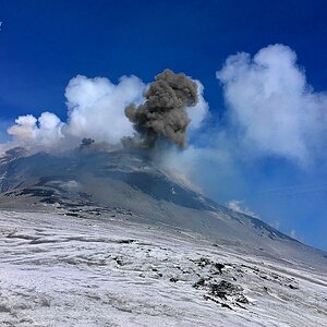
I took the first one about 2 years ago. I liked it but always felt something was missing with it. I burned in the clouds and played with the color the other day...which one should I put in my portfolio?

pic10.jpg


B_Bred.jpg
 
I didn't want to start a separate thread, so....

Here is a pic of a friend. He's not a model...just humoring me. What do you think of the photo? The black space on the right is where text would go if this were an ad.

model.jpg


One of the things I really need to work on is model repoir. So right now I really like to take shots with the model doing some action.
 
Of the first two it's the colored one that appeals to me most but it seems as though its lost some of the sharpness of the B&W one, a little unsharp mask needed perhaps?
 
hi shane,
its good to see your shots, i don't think you've posted for a while. I prefer the coloured shot, the clouds are more defined and it stands out more. Are those a couple dust specks there to left of the letters s and a?

Just out of curiosity, when you say portfolio, do you mean like an actually portfolio that you take to clients, or do mean your website or both?

My first impression of the 'model' shot was cool.. i like the informal pose and the skin tones look nice, but next thought was I wish it was bigger... i am having a hard time evaluating it at the current size.

cheers for that shane
 
Thanks. You're right I haven't posted here in a while. There's so much great stuff, I get a little shy.

I agree about the sharpness. And no those aren't dust specs...they are two birds that flew across the frame. I've toyed with taking them out.

I increased the photo size.
 
I agree with everyone. The toned version is definately my favorite. I love how the clouds sourround it giving it a vignetted look.
 
the model pic:

I really like this now, the shirt and jacket are really white, shiny and clean and it goes quite well with his dark skins good muscle tone, methinks this would be a really effective ad for a trendy mag.. what sort of advert did you have in mind for this?

also the folds in his shirt curve up and form a nice semi circle to the way he lifts his arm - there are alot of subtle appealing things to this shot.

i am not sure if this help, but since he has dark hair and the background is black its gets lost a bit. Its really not a big deal because it doesn't detract from this photo in anyway- the only reason i notice is because the bw shots i'm in my hair gets lost if the back ground is dark (now i have a bit o grey so its not a prob)

Do have any more of this one?
 
of the first two ... i'd say the b&w :D .. im partial to it ya know :lol:

the guy in the shirt .. hmmmmmm, im not feeling this one shane ... its not environmental enough to be a "portrait" (meaning him being spontaneous) ... and the background is black which would make me think studio ... it looks like there should be something happening in the background :?
 
I like the color version!

And I'd like to see more pictures of your friend! :oops:
What a good sport he is, modeling for you!

:D
 
Thanks everyone for your input. I especially like to be called out on my decisions...it makes me that much better. Let me add some stuff....

Pic 1. I really like the how the clouds came out...do you think I chose the right tint? I mean once I burned the clouds in...I can tint any color. Maybe more of a sepia?

Pic 2. I'm really interested in the commercial/fashion photography. I was really going for a pic you'd see in a magazine that was maybe teasing Calvin Klien's or Perry Ellis' new spring line, etc. Dew is right as it doesn't work as a portrait alone....but how does it work in the context I described.

Keep it coming...I really need some hefty critiquing.
 
I'm having a hard time deciding what I think. My first impression is that I like the straight BW. But then I wonder if it's the border that I like. I'd have to see the purple tone image with a border like the first to really decide. Without the border the sign is sort of floating in space, and it's hard to compare to the bordered example.

Unless the birds are more recognizable in the print, I'd say lose them. They look like dust in the scans.
 

Most reactions

New Topics

Back
Top