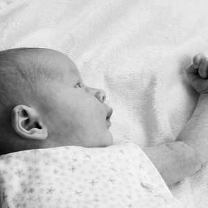
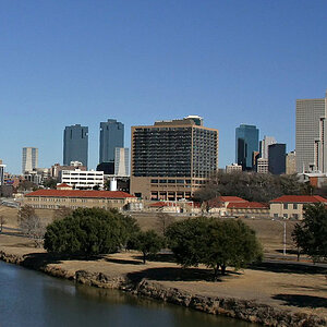
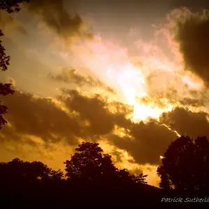
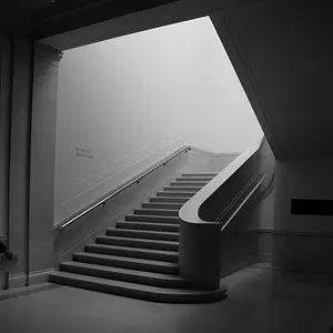
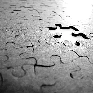
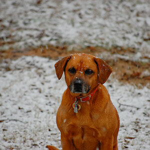
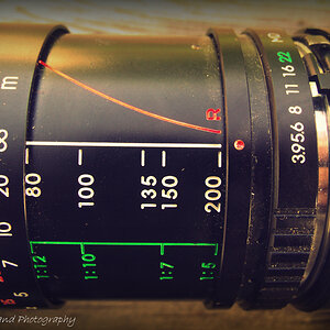
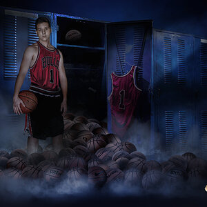
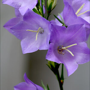
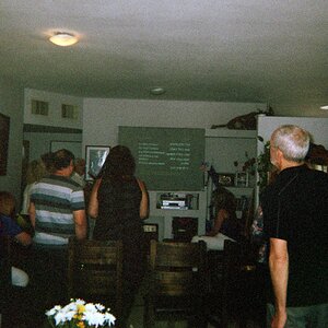
For an art show, I would select number 2. It is more of a stand alone image, and is comfortable for the eye to look at. By the way - they are all great shots! #1 is a little distracting for a show, people looking at it may get distracted by the extra detail in the left and leave wondering why that part was included. #3 is great for some uses, but too much background on the left for a show. #4 draws the eye up and out the left of the image and provides no comfortable place for the person viewing to rest and focus. The contrast provided in #5 does not really tell a story or enhance the left side of the image. My vote is #2, for a show.