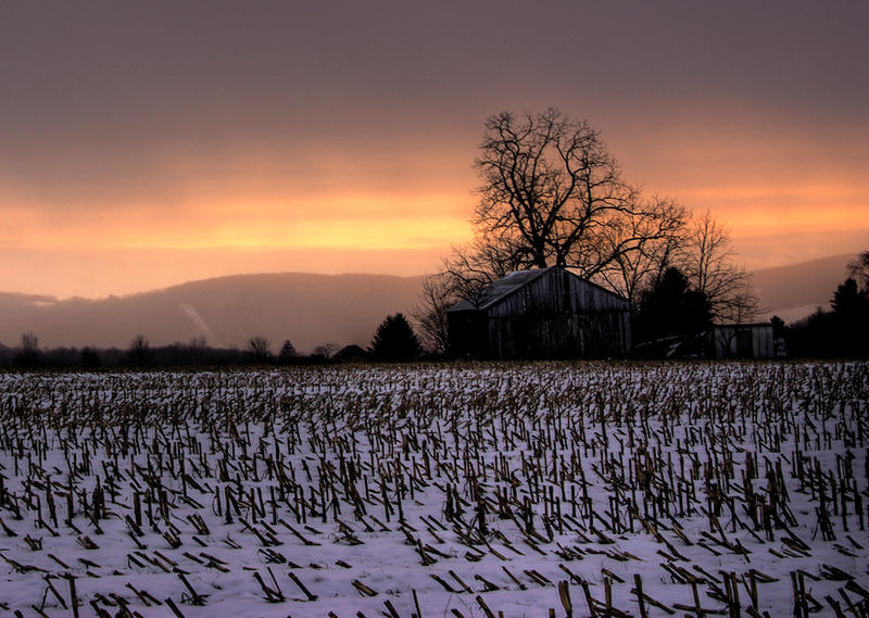
FYI I found out that i forgot to turn on "prevent ghosting" on photomatix...so i reran the hdr process..and edited in the new version into the original post. it looks better than the first assy version.
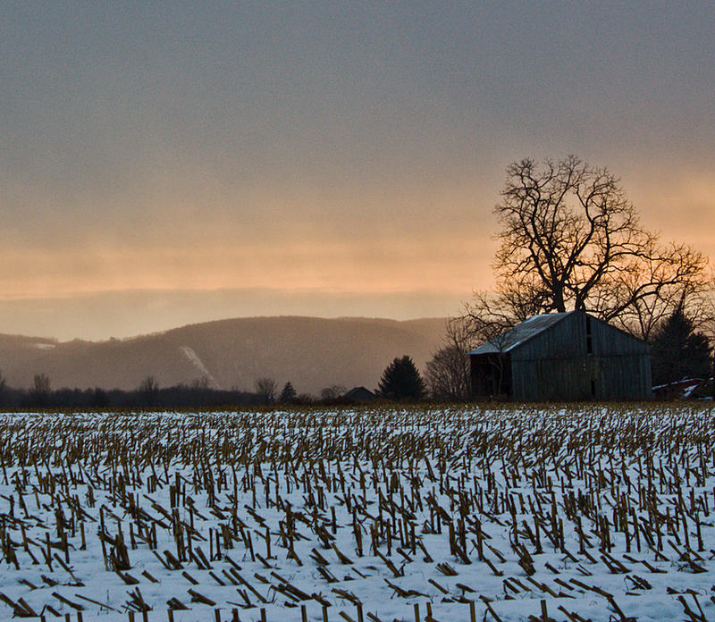
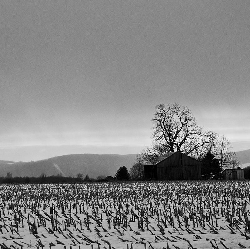
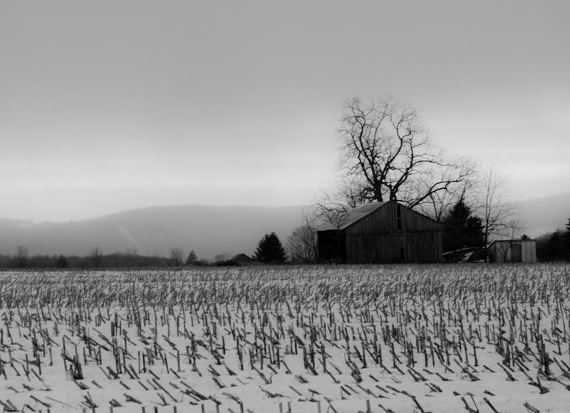
I like one but do not like the noise. The hdr one takes care of the noise but its a bit dark. I do love the contrast in the hdr one.
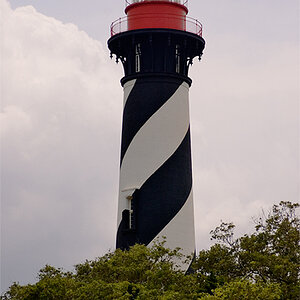
Also, I would recommend a tighter crop.
Maybe something like this. Im am only a beginner but here is what I had in mind. I did this in less then 2 minutes.
the noise was from the fact that i forgot i still had the camera on auto iso, and it was snapping things at 400...which isnt bad, but its a bad base to start off with if youve got any fixing to do after the pic is taken.
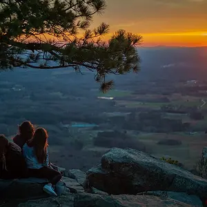
Hi. I like #3 the best. I like the colors, and the warmer tone makes it seem more comfortable -- more like sunset.
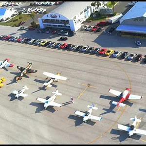
I think I might have preferred the black-and-white ones, but the building is too dark.
I think the buiilding is a little dark in all of the pictures, which takes out some of the character. Here's my take:
I was trying to give it more of an 'HDR' feel. It's a great picture, and I like the foreground leading into the building. It gives it a lot of character.






![[No title]](/data/xfmg/thumbnail/39/39271-04ff6ce1fbcda2b0d41ad7ee08cff91a.jpg?1734173231)