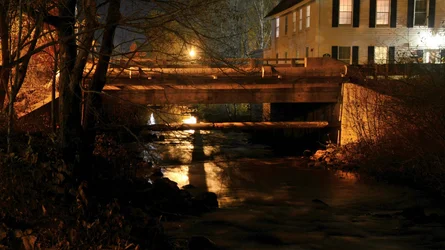
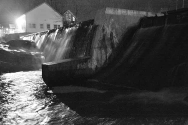
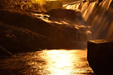
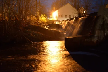
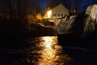
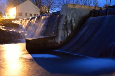
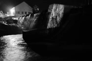
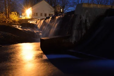
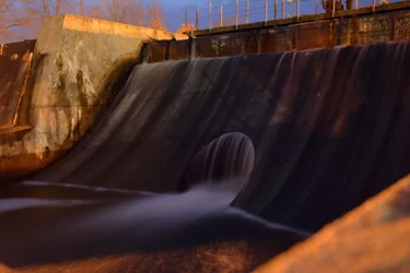
Some of them are overexposed for sure. This is very difficult lighting to deal with. Color is especially tough because the light on the building is orange and the shadows are blue. For me the straight B&W in the second post works best - surprisingly good for a straight in-camera jpg.
I agree about HDR often not working very well - it would get you all the detail in both the shadows and highlights, but that would end up looking fake and not that interesting, at least to me. Some "natural-looking" HDR work brings out more detail without looking fake, but not many people have the ability to do that.
Anyhow, back to these, I feel like that light on the building is killing me. I know this is subjective because some might want the light there to show where the reflections on the water come from or to accurately give the "feel" of the scene, where that light would be in your eyes, but I'm more interested in the contrast and textures in the stone and water, so the light is a distraction.







![[No title]](/data/xfmg/thumbnail/39/39290-dfb3e819bd94a7f30797638ae1ae27cf.jpg?1734173258)

![[No title]](/data/xfmg/thumbnail/41/41891-e5bba75ac5ce57c6892ade4cfc3f7d4c.jpg?1734176244)

![[No title]](/data/xfmg/thumbnail/37/37131-0af98967b391a8bd22ce1d14f6afb9cc.jpg?1734169834)