What's new

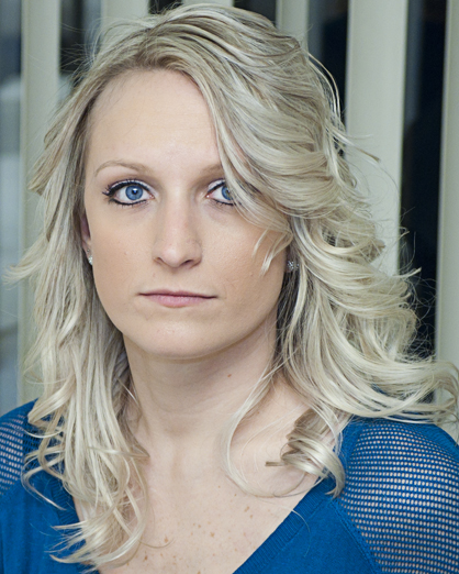
Wife Portrait for C&C.

Irishwake

TPF Noob!
Joined
Mar 28, 2006
Messages
63
Reaction score
2
Location
Washington, DC
Can others edit my Photos
Photos OK to edit
Let me know what you think, touched up a bit in photoshop to adjust colors, skin, cropping, the usual fixins. First real attempt at getting a good pre-set photo of a person.

Edit: Added second photo 2/15/11. Taken under the same lighting, used totally different PP technique. The exposure is still a bit much I know.. Anyway thoughts on number 2 please?

1.
004_by_adrenawake-d39f4a8.jpg


2.
005_by_adrenawake-d39m7xc.jpg
 
Last edited:
Nice enough picture, but the chair or table leg in the background is a bit unsettling. I bet his would have looked much better had the camera been turned to portrait orientation. As it is, we see 66 percent woman, and 33 percent background.
 
Trust me, that was bothering the crap out of me. Our apartment walls are FILLED with crap, and there just wasn't anywhere to go. It's a shelf with a whole bunch of pictures on it. I really want to get some studio equipment, ie a background so I don't have to deal with background distractions.

I guess I could have just cloned it out, maybe I'll do that.
 
The black thing in the background kills it for me. I also think you should've turned it to portrait orientation. The close crop to her chin and the empty space to the camera left is awkward.

Trust me, that was bothering the crap out of me. Our apartment walls are FILLED with crap, and there just wasn't anywhere to go. It's a shelf with a whole bunch of pictures on it. I really want to get some studio equipment, ie a background so I don't have to deal with background distractions.

I guess I could have just cloned it out, maybe I'll do that.

Just get a cheap sheet from walmart. I believe the queen size I bought was 14 bucks. I have a hard time with wrinkles though so some have suggested to get a fleece sheet instead.
 
The eyes in a portrait should be in the top 1/3 of the frame. Had you rotated your camera 90°, you would've been much further towards that end.

Visine.
 
The eyes in a portrait should be in the top 1/3 of the frame. Had you rotated your camera 90°, you would've been much further towards that end.

Visine.

Okay I'm gonna chalk all this up to a good lesson in people photography. I shot this way because above her were more shelves, below and behind her was our kitchen table, to the right is the openness to the hallway / livingroom with even MORE clutter.

I think I could have fixed all of this had I just gotten a little closer. I have several shots that are in portrait as opposed to landscape but this was the only one that came out clear and didn't have her making a silly face.

Thank you all for your input.
 
is it just me... or does her face look orange? ;/ maybe a tad bit warm? Her hair and eyes are gorgeous!
 
Her skin tone is very uneven with her chin looking white and the rest of her face looking very orange. I like the fact that she isn't smack bang in the middle of the shot, but at the same time you have lopped off her lovely hair and you could have elongated her considerably but not chopping her off so close to the chin. I agree that she has lovely eyes, but I don't think that this is at all flattering. The furniture directly behind is a major distraction also..
 
Her skin tone is very uneven with her chin looking white and the rest of her face looking very orange.

Her skin tone being uneven is her makeup, which she likes because it makes her look tan, even though it doesn't match the rest of her, and I wholeheartedly agree that it looks silly. This can easily be fixed in Photoshop.

I like the fact that she isn't smack bang in the middle of the shot, but at the same time you have lopped off her lovely hair and you could have elongated her considerably but not chopping her off so close to the chin.

It's chopped because, and you can still almost see a piece of it in the photo, directly behind her hair where I cropped it is a hallway with our thermostat and AC vents on the wall. Hard to believe but it was even more distracting having that there.

I agree that she has lovely eyes, but I don't think that this is at all flattering. The furniture directly behind is a major distraction also..

Yup, need a backdrop! I'm going to add these things to look for when composing / touching up from now on. Most of this would have been fixed with a backdrop, because then the lighting would have been even, and I wouldn't have had to crop the picture to remove unwanted clutter.

Thank you, as well as everyone else, for your input.
 
Personally feel the second shot is better. :)

Landscape don't really look good for the first shot.
 

Create an account or login to comment

You must be a member in order to leave a comment

Create account

Create an account on our community. It's easy!

Log in

Already have an account? Log in here.

Back
Top Bottom