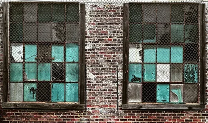
I find the upper edge really distracting. The tips of the fence are right on the edge, or cut off, and the whole upper edge is very bright.
The windows themselves are interesting, but they're positioned in a bad way for a photo. I think the best you could do (and this might be really good) is to make two images, each window cropped down to the glass and metal parts, and combine them in a diptych, where you could position them closer together.





![[No title]](/data/xfmg/thumbnail/31/31045-f4eb92f5d5eaca89ec5966763eea2dae.jpg?1734159149)



![[No title]](/data/xfmg/thumbnail/40/40310-01bec1b9b7918522bf21a09cf75c5266.jpg?1734174717)