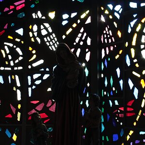
i dunno. I like the corner being place on the third line. i like whatever it is on the left wall giving symmetry with the top of the door frame on the right. Whatever is on the left wall that is square makes a great space filler and give some balance. I like the general perspective of the frame. It was shot seemingly strong. I like the textures, processing. I like the door and the ramp to it. As the title states though "women" my eye is consistently drawn back to the corner and the women sign because of the power of its placement in the pic and it being darker/higher contrast.. And i am not sure if i like that because the sign isn't that interesting. You shot it well, and strong. Being drawn back to the sign over and over is just a little nerve wracking.
There is no tension, yet, there is no hierarchy. It's all balance and no payoff. I feel like I should love it - on many conceptual levels I think it should "work" for me. Yet, for some reason it just doesn't.


")


![[No title]](/data/xfmg/thumbnail/42/42479-eb9612f7aa37a41755b9e23b5739a3bf.jpg?1619740195)


![[No title]](/data/xfmg/thumbnail/33/33362-84aacb865117bf8cba89104b89e9b36c.jpg?1619735927)