You're talking about selective coloring, or selective black and white, and it's the worst reason to open photoshop. It almost always look terribly awful, cliche, and not remotely artistic, as much as people think it might look that way. For me, it's the equivalent of an author who, instead of crafting their words in such a way that a certain important piece of the text jumps out and grabs the reader's attention, decided to just print that piece of text in red and with bold letters. Might as well just photoshop in some arrows in you image pointing at what you want to focal point to be.
If you want viewers to be drawn to a certain part of your image draw them there through the finely crafted use of composition, leading lines, control of light, removal of competing elements and subtle editing techniques. But the standard approach to selective coloring is like a big neon sign which reads: "Look at me! Look at me!".
I have seen some very good examples of selective coloring, but they are very few and far between, and mostly in cinema. Namely Schindlers List and Sin City. But for the most part, I've hated nearly every example that I've seen.



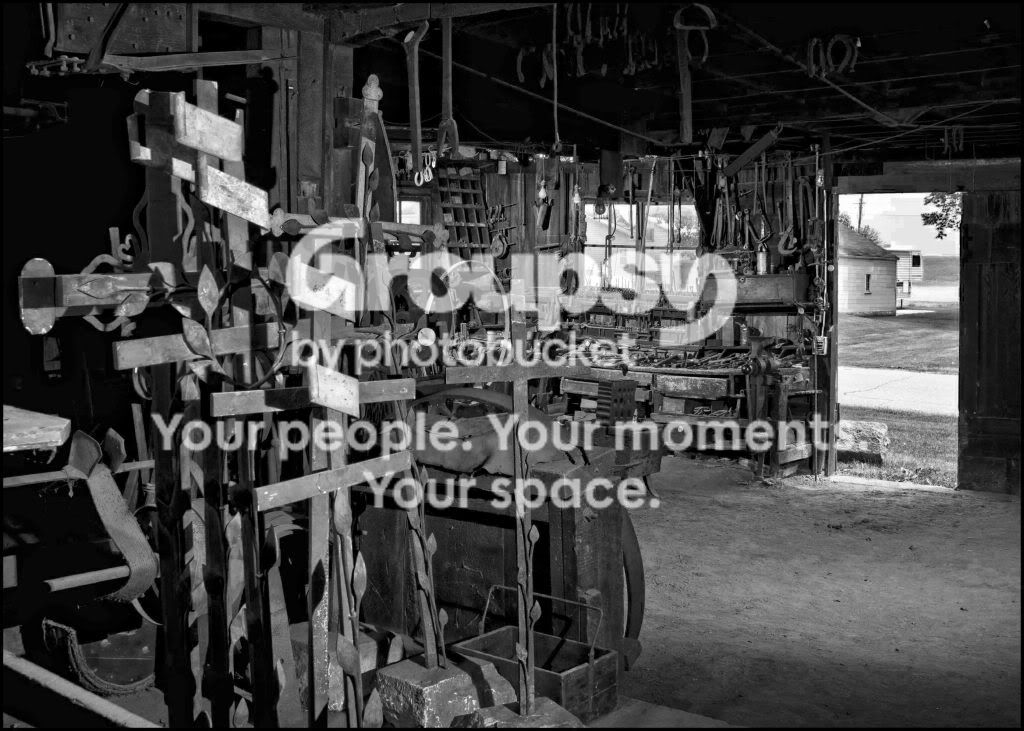
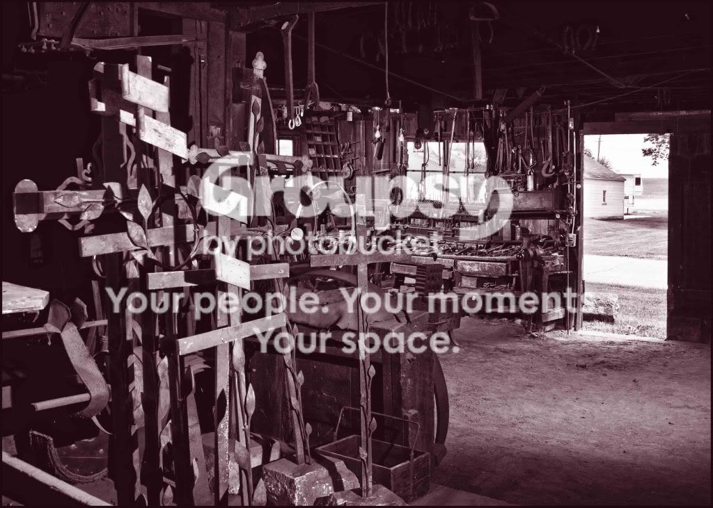
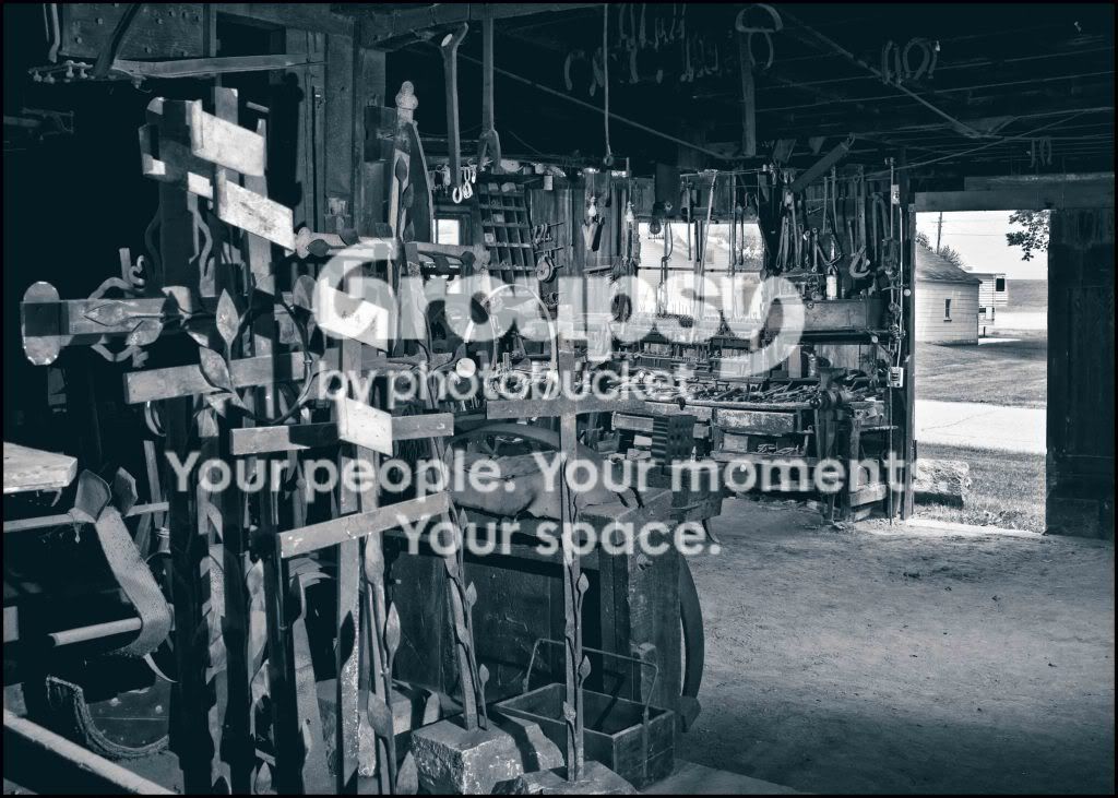




![[No title]](/data/xfmg/thumbnail/36/36644-d48bde7a35945a119c05c18e8c748c27.jpg?1734169161)