What's new

Workshop Wall

PixelRabbit

A naughty little bunny...
Joined
Nov 28, 2011
Messages
6,593
Reaction score
3,719
Location
Ontario
Can others edit my Photos
Photos NOT OK to edit
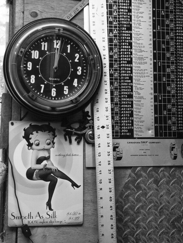
I love this section of wall in Mr. Rabbit's shop. The metals and textures just keep drawing me in but I have had a hard time capturing it. Finally I clued in and went with B&W to take a bunch of "too busy" out of it.

Would love to hear your thoughts, thanks for taking a look!
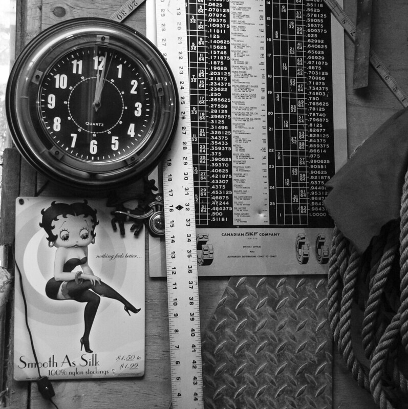
 
zOMG--I have almost that SAME neon clock in my living room!!!!!
 
It's an awesome clock!

Perhaps it may give you an appreciation for why I went with black and white ;) the colours are just too different and don't read well together.
 
It's a nice shot. good tones and textures. The betty boop images gives the old feel along with the clock.
 
Nice - I like it. "Smooth as Silk" and diamond plate - there's a good contrast!
 
I don't think this is ideally framed and composed.
It has all these vertical elements that are contradicted by the square crop and the rope on the right just attracts attention without being part of any composition.
I would frame it differently (and take out the bright corner on the top left)

8417779824_2aa7cf8173_c2222222_zpse837ea58.jpg
 
Thanks everyone :)

Lew, yanno, I did that crop also and chose this one to upload instead.
crazy-msn-emotions-head.gif

Looking today with fresh eyes I agree with you 100%, I like the rope and the texture it brings but it stops the flow of the image and it's not a good tradeoff. I will have to see if I can get the rope in there in a different composition.

Here is the crop that I did originally.

 
I would say it lacks a focal point. My eyes don't know where to "rest".
 
Thanks everyone :)

Lew, yanno, I did that crop also and chose this one to upload instead.
crazy-msn-emotions-head.gif

Looking today with fresh eyes I agree with you 100%, I like the rope and the texture it brings but it stops the flow of the image and it's not a good tradeoff. I will have to see if I can get the rope in there in a different composition.

Here is the crop that I did originally.


The only thing I would change about this crop is the slight divergence from vertical on the right.
I think that, in an image with different vertical lines, that the composition must establish something as vertically correct - unless there is an artistic reason to have everything off-kilter- so that the viewer is satisfied with the realness of what they are looking at.
In your framing, the list of numbers is cut off on a slant - and thus it draws attention - I would rotate a bit so that an expected something is vertical and the viewer can thus accept that the world is OK and they can look at the design rather than trying to figure out what is happening.
I realize that this is a minor point but it did occur to me and so I thought I'd share it.
 
I like the original because of the other ruler (looks like a tape measure) in the upper right, and also the contrasting textures of the rope and cloth. I see Lew's point about the strong vertical elements, but that might be addressed by removing the ruler that passes through the frame (I assume he wouldn't mind, or perhaps he wouldn't even know ...).
 
(I assume he wouldn't mind, or perhaps he wouldn't even know ...).

I realize that sometimes (many times)[perhaps often], I sound pompous and know-it-all.
For that I apologize in retrospect and in advance.

My only excuse is that I probably am pompous and a know-it-all and, even though I try to hide it under a veil of ordinariness, these character faults occasionally just break out.
Feel absolutely free to ignore the worst things I say. :x
 
Lew, I read Kens remark on not knowing as Mr Rabbit wouldn't know I moved the ruler.... But I may be wrong lol
 
Haha, I think you might be safe this time around ;)
Good point about the numbers on the right, I actually often find I have that problem in my shots and almost exclusively on the right side (probably a composition thing) Here is another example where I have the same issue on the right http://www.thephotoforum.com/forum/general-gallery/315226-railing-perspective.html.

Thanks Ken, I'm going to take a look at the other shots I took and see if there is a better candidate to get the rag and rope in, I really like what they add but as you said, I may have to "tweak" Mr. Rabbit's decorating decisions lol
 

Create an account or login to comment

You must be a member in order to leave a comment

Create account

Create an account on our community. It's easy!

Log in

Already have an account? Log in here.

Back
Top Bottom