Wreck the dress - 4 for C&C

oldmacman

TPF Noob!
Joined
Jul 16, 2010
Messages
1,597
Reaction score
70
Location
Southern Ontario
Website
www.mcavoyphoto.com
Can others edit my Photos
Photos OK to edit
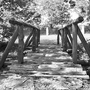
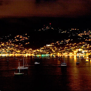
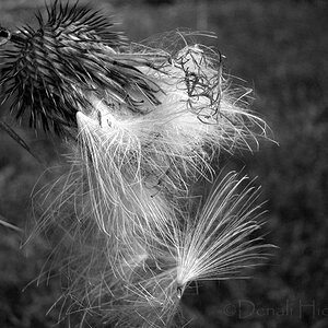
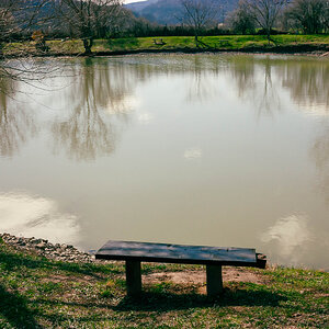
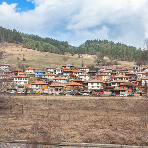
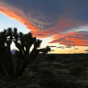
I like these four from a just for fun shoot yesterday. C&C always appreciated.

1.
laken-1.jpg


2.
laken-2.jpg


3.
laken-3.jpg


4.
laken-4.jpg
 
Man you're really onto something... I can't quite put my finger on it, but I see it. The 4th is closest, but there's something odd about it... it's almost like she was photoshopped in.

Still... interesting with the blues and whatnot... it's hard to say "keep working at it" given the dress-wrecking scenario, but ... keep working at it.
 
I agree w/ Man.......I like something about it but it's not a finished project.
 
I think bringing your background exposure up a stop to a stop and a half will make her look as shes not artificially lit, maybe you need to throw a 1/4 CTO on the flash to make her look less blue? unless you want her skin to be a little blue as it stands now.
 
I agree with manaheim. I really like these, tho I'd like to see #1 in color as well. Given the mood created by the beautiful blues throughout this set, B&W just doesn't work.
 
I quite like 2 and 4, and I agree with colour tones making it. The 3rd is much more ultramarine compared to these two. Doesnt seem to fit there...
 
Man you're really onto something... I can't quite put my finger on it, but I see it. The 4th is closest, but there's something odd about it... it's almost like she was photoshopped in.

Still... interesting with the blues and whatnot... it's hard to say "keep working at it" given the dress-wrecking scenario, but ... keep working at it.

I am processing in Photoshop, but not cutting and pasting. To add some drama to the lighting, I have multiplied in a blue layer and then masked away some of the layer over the skin and hair. I guess I still need some refining, or maybe less severity in contrast between the layers. Thanks for the feedback.

I agree w/ Man.......I like something about it but it's not a finished project.
Thanks. Yes, my first attempt at this level of processing, so you are correct that it is a work in development.

I think bringing your background exposure up a stop to a stop and a half will make her look as shes not artificially lit, maybe you need to throw a 1/4 CTO on the flash to make her look less blue? unless you want her skin to be a little blue as it stands now.
I actually knocked back the background to simplify the compositions. I found there was too much detail competing with the subject. I'm not saying it was the best decision, but that was my process when contemplating how I wanted these images to be completed. She is also very tanned and I reduced the orange/red saturation because she seemed to glow against all the blue. Perhaps I went too far.

I agree with manaheim. I really like these, tho I'd like to see #1 in color as well. Given the mood created by the beautiful blues throughout this set, B&W just doesn't work.
I had done a BW conversion of each image and then applied a colour treatment to some of them. I had really liked the closer crop and BW of the first image. Here it is in colour from the gallery I made for the subject. A little looser on the crop and watermared.
Laken-30.jpg


I quite like 2 and 4, and I agree with colour tones making it. The 3rd is much more ultramarine compared to these two. Doesnt seem to fit there...
Good point. I wasn't really comparing them as I was processing.

Thanks for all the feedback. Certainly lots of good details to watch for and be aware of.
 
I agree with man too ;)
 

Most reactions

New Topics

Back
Top