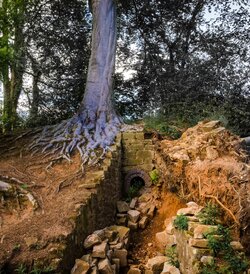
Yes, the tree trunks really were that colour

Pejacre

No longer a newbie, moving up!
Joined
Jun 20, 2014
Messages
308
Reaction score
101
Location
North Wales, UK
Can others edit my Photos
Photos OK to edit
Been away for a while - I'd like to say improving my photography but it's been more like just living my life and sometimes taking a camera along. Anyway, would appreciate C&C on this one if anyone has a few moments to put finger to keyboard.

D7K_8812.jpg
 
Last edited:
Lol Todd. Sorry, like I said, been away and forgot how to work things here - should be visible now.
 
To be a bit blunt, I'm unsure of the subject in the photo. In reference to rule of thirds, my eye is drawn to the brick in the center of the frame. Personally, I would have moved to the brick to the left, providing a border, and putting the odd colored trees more in the center. Furthermore, the color is relatively mundane. The lighting is good, but addding more contrast to the tree trunks would help them stand out better against the bright green foliage.

-this has been provided from an amateur
 
To be a bit blunt, I'm unsure of the subject in the photo. In reference to rule of thirds, my eye is drawn to the brick in the center of the frame. Personally, I would have moved the brick to the left, providing a border, and putting the odd colored trees more in the center. Furthermore, the color is relatively mundane. The lighting is good, but addding more contrast to the tree trunks would help them stand out better against the bright green foliage.

-this has been provided from an amateur
 
I know you said that's how it really looked, but the background looks strange to me. I do like it, I love cool looking trees! :1219:
 
I think I want to .. well lick that tree. Just to see!
Never seen purple trees :) Very cool root system on them. Do you know what they are?
 
I do not think the composition is very unified. The left third of the frame makes a nice tall image.

The central segment makes a nice square-ish image.The rotted old stump on the left third of the scene is an eye-catcher, and needs to be eliminated to make a good image out of the central section of the overall photo; I can see that by cropping off a bit more than the left third, and a bit less than the right side third, one could make a fairly interesting image by eliminating the pull of the tree and stump and that diagonal downed tree..

The right hand third, with the upended rootball and dirt, and the down tree's trunk on a strong diagonal,leaving the frame, is not very good on its own, and it is hurting the overall composition as well.

The background does look a bit odd...I suppose it is some wind blur or something? The photo has a slight softness to it, a watercolor-like feeling, yet with more detail than a watercolor painting would have, but the overall feeling is trending 'soft'. The landscape has a lot of angular movement to it. The trees, left, right, and far right edge, each have a LOT of visual "pull" to them; all three can simply not co-exist in one frame shot from this camera placement.
 
Nice crop Derrel - think I had a bad case of trying to get too much in!
 
Pejacre said:
Nice crop Derrel - think I had a bad case of trying to get too much in!

Thanks. Glad the crop is not too awful-looking to your eyes. lol... But yeah...I know the feeling of trying to get too much in. This is actually a very interesting scene, and an unusual scene. The hollowed out, presumably rotten log's old stump...the wind-downed tree on the right...the old brick drainage outflow opening (is that a drain pipe?)...the crumbled old wall blocks...some interesting stuff there. I just thought the side stuff was too complicated for one composition, and that a rather square-ish, squat, solid compositional shape would work for showing the central aspects of the scene: the weird tree trunk, the tree's exposed roots, and the ditch/brick drain. i do not generally see in wide-angle much, so to me, going with the narrower angle of view is my normal way of looking at landscapes.
 
Wow, at first I said to myself ....nice shot , then saw Derrel's crop.
Even better....

ken
 
D7K_8812.1.jpg
REALLY that color?


Wow!

EDIT- PS: notwithstanding this silly post- a really nice image!
 
Last edited:

Most reactions

New Topics

Back
Top