stephluna97
TPF Noob!
- Joined
- Jun 27, 2015
- Messages
- 2
- Reaction score
- 0
- Can others edit my Photos
- Photos NOT OK to edit
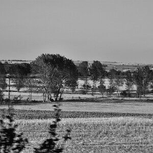
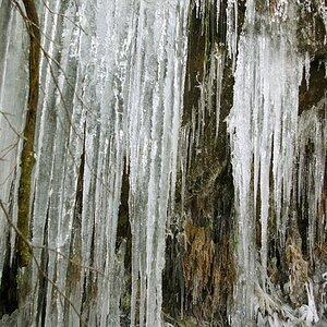
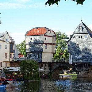
I am new to this forum and found it simply because I was looking for a place to share my photos. I've been experimenting with photography for about 5 years and recently discovered that portraits are what I love shooting most. I would really appreciate some feedback on these, thank you!

![[No title]](/data/xfmg/thumbnail/39/39188-ef8378fc9359eda8e99899c2e12f3892.jpg?1619738906)


![[No title]](/data/xfmg/thumbnail/40/40288-4d5d7a8aa74ddfceb5fb82062d9b21be.jpg?1619739409)