Critique on flyer

DeepSpring

TPF Noob!
Joined
Jul 12, 2006
Messages
1,451
Reaction score
0
Location
Los Angeles
Website
www.joshualights.com
Can others edit my Photos
Photos OK to edit
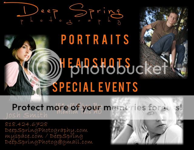
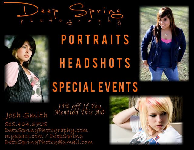
I am planning to go and try hanging this up around town and I was wondering if any of you had anything to say about it. Something I should change or move around or maybe you remember one of my other pictures which you think would fit better. Thanks a lot.
Promoadjuly07copy.jpg
 
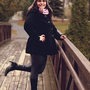
i would change the word 'if' to "when' when you mention this add. i like the close up pic you did of the girl on the top right, the one in senior portraits. you should consider posting that one
 
i would stick to one text and make it all the same color.

maybe put the 15% bit on the back? i think it looks strange.

finally i would make the border solid instead of a blur.
 
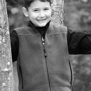
I would change the top right image, it's not as good as the other two included. I agree put the 15% on the back.
 
I'll change the top right pic but this is going to be posted on walls so I don't have the option of putting anything on the back. I'll also look into the fonts a bit more. And the "when"

Do you think it wouldn't look as good if the top right pic was one of the same girls that are on there? Reason being my best pics are with those 2 girls but I don't want it to look like they are the only ones I've shot.


How about this as the third? I know in this version it looks over sharpened but thats just the resizing, real one looks better.
20070620_4198.jpg
 
Yes, I would use one of him instead of the same girl because you don't want clients to think you've only shot the two girls. Just make sure it doesn't look oversharpened on the flyer!
 
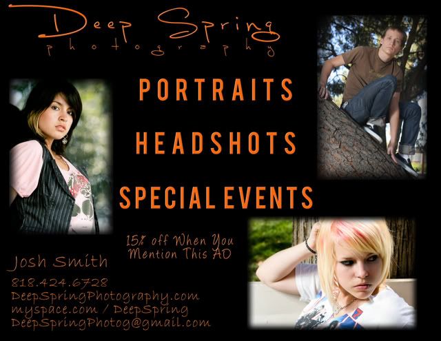
Ok what do you think about these? I think I like 1 more but I can't really make up my mind. I like them each for different reasons. 1 you feel a connection betweenyou and the model but I think 2 has a better technical side.

1
Promoadjuly07-2ndversion.jpg


2
Promoadjuly073rdversion.jpg
 
I don't like the bottom one b/c the model isn't giving the reader eye contact. When somebody reads a flier... eye contact is good.

And I'd suggest trying a mockup where you switch the boy on the tree with the brunette girl.

Also, I wouldn't capitalize the word "AD".
 
I work in the advertising business, specifically out of home advertising........


you need to simplify your flyer, it takes to long to read. You need to catch a viewer quicky and immediately engross them.

script text is impossible to read from a distance

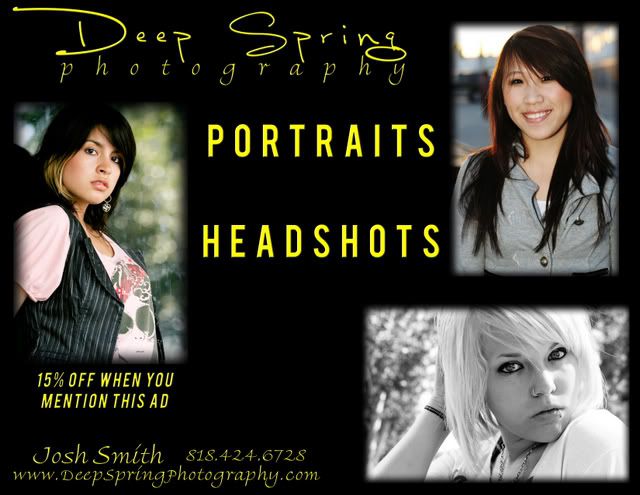
the orange type is too dark and does not contrast with the black......try reflex yellow.......yellow and black are the #1 easiest read color combo.
 
I do this type of thing as well as photography and video/television.

You are emphasizing portraits, head shots and special events in your text but not in your photos. Your portraits and headshots have a problem considering the top of the head is cut off in two of them and the hair blends into the background with the other. The pose of the guy with the jeans that are a little too dark visually is awkward particularly with his arm between his legs. All colour is better than black and white but the eyes must be visible and bright which is not true in the lower colour shot.

You need an excellent shot of a special event to go with your text.

There are guidelines for graphic and printing as well and use of fonts is an important item. The fonts have to be similar in style and readable from the distance that most people would read a poster. This is certainly not the case with your advertisement.

I would suggest that you look at some books on printing and page design that deal with such things as image, communication, style and present ideas on how to match what you want to communicate with your ad and the appropriate fonts and location and style of images that work.

Your general idea is OK but page design is a completely new area of technique, expertise and composition.

skieur
 
Thanks for all the replies. I really appreciate all the information. I;m going to take a look like suggested for some more information about design and I'll be back soon enough with another version.

I'm thinking about taking off the special events and just leave it at portraits and head shots since that is more what I'm focusing on. I have a shot of another girl I think would be good to replace the boy one. It is a lot simpler than the others and more of just a basic head shot w/ full head in frame
 
Somehow the text plays a stronger role then the images. That is never good for a photographer. Photography can be a saturated market. With any kind of luck your work will make you stand out. Make that your focal point.

Also consider that black backgrounds are hard to pull off in any medium except for the web. Keep it simple and of course very pleasing to the eye.

Luv And Bass
 
I decided to un clutter it a bit and take off the contact info, I'm going to have business cards with it for people to take. I'll just have my name and website.

I'm still working on it tho
 
Here are new ones. I've been looking around online for some websites about design but I can't seem to find many good ones. <aybe I'm searching for the wrong thing so I was just wondering if anyone had any sites they knew were good or books that are good.

Anyways here they are. Only difference is placement of the 15% off, I can't seem to find a place I like.

Promoadjuly07yellow2.jpg


Promoadjuly07yellow.jpg
 

Most reactions

New Topics

Back
Top